Container offices Office interior by Five Am |
Home > Winners > #27859 |
 |
|
||||
| DESIGN DETAILS | |||||
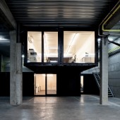
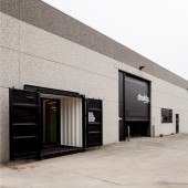
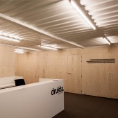
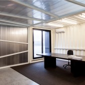
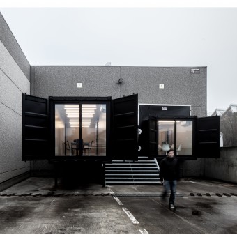
| DESIGN NAME: Container offices PRIMARY FUNCTION: Office interior INSPIRATION: This design is in fact an answer to the demand of building so cheap as possible. Now firms can't invest a lot of money in new interiors, so designers also need to be creative with the budget. That's why we like to use budgetfriendly or secondhand materials in our designs. UNIQUE PROPERTIES / PROJECT DESCRIPTION: In a big hall of 4000 sqm, belgian designers five AM placed 13 second hand shipping containers to create an office space for drukta & formail, two printing companies. the concept was to create a certain experience for every visitor/user, linking the offices between the workshop so the bosses can see their employees, and the visitors can explore the huge machinery. three containers pop out of the building to get as much natural light as possible, both located through the existing loading docks. OPERATION / FLOW / INTERACTION: The main goal in this project was letting the visitor experience something that they won't forget. When they enter both interiors, they are amazed that they are inside a container, but more important,they get a great panorama to the production hall. They can see & smell the printing production.On the other hand, the staff of both firms get connected to the staff inside the office. They can have quick meetings about printing problems, ask eachother questions and see if there is something wrong in the production process. PROJECT DURATION AND LOCATION: The project started with the first designs in February 2012. The construction took place from August 2012 till Novembre 2012. The project is situated in Kortrijk, Belgium, nearby an important highway. FITS BEST INTO CATEGORY: Interior Space and Exhibition Design |
PRODUCTION / REALIZATION TECHNOLOGY: To design the installation, we made many scale models in cardboard to symbolize the containers. Like this we could see what impact the containers will have on the existing hall.The containers,we picked out ourselves,got sandblasted and got a new layer of lacquer afterwards.They got welded to each other on site.For the interior we used construction materials like MDF & plywood, to keep the budget low. On the other hand de structure of the plywood delivers a warm and cosy feeling. SPECIFICATIONS / TECHNICAL PROPERTIES: 4000sqm building of which 290 sqm office space Drukta has 150sqm Formail has 75 sgm atelier and 65sqm office The overall budget was 280000 euro. TAGS: interior,office,ship RESEARCH ABSTRACT: - CHALLENGE: The hardest part of the design was keeping the budget as low as possible. The client wanted a lot for less. It was our task to implement all their demands in the design without exceeding the budget. To accomplish that we needed to be creative, like multi-use of a meeting room that can be used for staff meeting, but also for lunch. ADDED DATE: 2013-02-18 23:55:46 TEAM MEMBERS (3) : Interior Architect Caluwier Olivier, Interior Architect Bellens Mathieu and IMAGE CREDITS: Five Am, 2012. |
||||
| Visit the following page to learn more: http://www.fiveam.be | |||||
| AWARD DETAILS | |
 |
Container Offices Office Interior by Five Am is Winner in Interior Space and Exhibition Design Category, 2012 - 2013.· Read the interview with designer Five Am for design Container offices here.· Press Members: Login or Register to request an exclusive interview with Five Am. · Click here to register inorder to view the profile and other works by Five Am. |
| SOCIAL |
| + Add to Likes / Favorites | Send to My Email | Comment | Testimonials | View Press-Release | Press Kit | Translations |
Did you like Five Am's Interior Design?
You will most likely enjoy other award winning interior design as well.
Click here to view more Award Winning Interior Design.


