| THE AWARD |
| CATEGORIES |
| REGISTRATION |
| SUBMIT YOUR WORK |
| ENTRY INSTRUCTIONS |
| TERMS & CONDITIONS |
| PUBLICATIONS |
| DATES & FEES |
| METHODOLOGY |
| CONTACT |
| WINNERS |
| PRESS ROOM |
| GET INVOLVED |
| DESIGN PRIZE |
| DESIGN STORE |
| THE AWARD | JURY | CATEGORIES | REGISTRATION | PRESS | WINNERS | PUBLICATIONS | ENTRY INSTRUCTIONS |
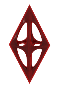
Fly Light Alcoholic Beverages by Valerii Sumilov |
Home > Winners > Design #33218 >Interview |
 |
|


FS: What is the main principle, idea and inspiration behind your design?
VS: This design is aimed at a particular age group, so it was very important to create something that would communicate with the young generation, speak their language, while looking attractive and cool. Making a vivid, modern design that would deliver the message to its audience was the main inspiration behind this project.
FS: What has been your main focus in designing this work? Especially what did you want to achieve?
VS: I was inspired by the idea of creating a design oriented towards the young generation. I wanted to make up and embody a design, which would communicate with the target audience using their language. Which would be close, clear to them, address their daily needs. Besides, I wanted to make a stylish, modern and attractive design, so that my client’s product would compete successfully against the other players on the light alcoholic beverage market. And, of course, I strived to create a design, which would fully reflect the product’s name “Fly”, but do it in a very delicate way, not so obvious as most other designers would do.
FS: How long did it take you to design this particular concept?
VS: The work on the project started in October 2013 and ended in December 2013. The product will be available on the shelves in Moldova around January 2104.
FS: Why did you design this particular concept? Was this design commissioned or did you decide to pursuit an inspiration?
VS: The agency was given the task to create a complex design for a new product in the customer’s niche. While working on the concepts we’ve taken into account the following factors in order to maintain the correct brand positioning: To assess the target audience correctly, create a portrait of the consumer, understand and apply consumer insights in the design. To make an unknown product stand out from the range of competitors, and create a unique, individual identity for the new brand. To take our client’s technical abilities into account: requirements for label application and bottle design.
FS: What made you design this particular type of work?
VS: This project was quite ambitious and voluminous. A new product had to be introduced to the market, which shares fierce competition. That’s why the main task was to make the new product stand out from the rest of competitors, attract the consumer’s attention and create a stable and memorable image for the next purchase. This all required a unique communication route to be found with the product’s target audience.
FS: Where there any other designs and/or designers that helped the influence the design of your work?
VS: The main source of inspiration for this project is the location icon from the Google Maps application - a symbol, which is widely recognized among a broad range of customers. It's a postive sign, which acts as an eye-stopper and this was definitely the element we wanted to use in our concept.
FS: Who is the target customer for his design?
VS: The design's target audience is the young generation, teens and young adults who spend a lot of time chatting with their friends on Facebook or other social networks. That's why this design employs certain elements that are recognized by this particular age group.
FS: What sets this design apart from other similar or resembling concepts?
VS: I think that the main thing that sets this design from other similar projects is the way the trademark was represented in the end. While most agencies would definitely exploy various conceptsbased on the concept of flight due to the trademark's name, we've strived for something more subtle, not as direct and obvious as one would expect. And we are very pleased with the outcome of this project.
FS: Who did you collaborate with for this design? Did you work with people with technical / specialized skills?
VS: This design was developed purely in-house.
FS: What is the role of technology in this particular design?
VS: The project was designed and implemented using transparent self-adhesive film. As a result, when looking at the bottle you don’t see any label borders, which creates the impression that the design was applied directly to the bottle. We also have to note that special paints were used, for example dense matte white, in order to achieve a very clear and bright white color. Besides, we’ve used a set of post-printing techniques such as tactile varnish.
FS: Is your design influenced by data or analytical research in any way? What kind of research did you conduct for making this design?
VS: Of course, there was an extensive research into the market this product was aimed for. Since the target audience for this product is young it was very important to learn the visual language of the younger generation and find particular symbols that would draw their attention. So we've spent a lot of time researching the modern visual culture of the Internet.
FS: What are some of the challenges you faced during the design/realization of your concept?
VS: The hardest thing about this project was finding the rational grain, which would be able to hook the product’s consumer. We had to avoid corny, simple and obvious while working on the trademark. Another factor that had to be considered and succeeded in was the client’s approval. That’s why when attending the artistic council, which was making decisions in every concept proposed, I had to communicate with mature and conservative members of the council and explain the idea behind every concept.
FS: Thank you for providing us with this opportunity to interview you.
A' Design Award and Competitions grants rights to press members and bloggers to use parts of this interview. This interview is provided as it is; DesignPRWire and A' Design Award and Competitions cannot be held responsible for the answers given by participating designers.
| SOCIAL |
| + Add to Likes / Favorites | Send to My Email | Comment | View Press-Release |
