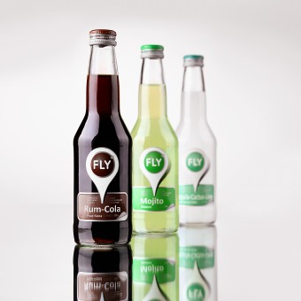
Fly Light alcoholic beverages by Valerii Sumilov |
Home > Winners > #33218 |
 |
|
||||
| DESIGN DETAILS | |||||
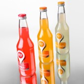
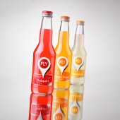
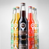
| DESIGN NAME: Fly PRIMARY FUNCTION: Light alcoholic beverages INSPIRATION: I was inspired by the idea of creating a design oriented towards the young generation. I wanted to make up and embody a design, which would communicate with the target audience using their language. Which would be close, clear to them, address their daily needs. Besides, I wanted to make a stylish, modern and attractive design, so that my client’s product would compete successfully against the other players on the light alcoholic beverage market. And, of course, I strived to create a design, which would fully reflect the product’s name “Fly”, but do it in a very delicate way, not so obvious as most other designers would do. UNIQUE PROPERTIES / PROJECT DESCRIPTION: I’ll elaborate a bit further on the eye-stopper. It’s a very important element for any successful design, from the sale point of view. Besides making the product stand out on the shelf, it also plays another role – it increases the brand’s recognition and increases loyalty among the consumers. The “FLY” brand becomes memorable, which is very important for a new player entering the market. OPERATION / FLOW / INTERACTION: This is a light alcoholic beverage sold in retail stores and supermarket chains. The design’s priority mission was to attract the buyer’s attention to the new product and make them want to take it from the shelf. PROJECT DURATION AND LOCATION: The work on the project started in October 2013 and ended in December 2013. The product will be available on the shelves in Moldova around January 2104. FITS BEST INTO CATEGORY: Packaging Design |
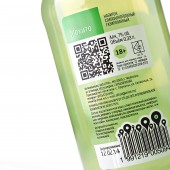
PRODUCTION / REALIZATION TECHNOLOGY: The project was designed and implemented using transparent self-adhesive film. As a result, when looking at the bottle you don’t see any label borders, which creates the impression that the design was applied directly to the bottle. We also have to note that special paints were used, for example dense matte white, in order to achieve a very clear and bright white color. Besides, we’ve used a set of post-printing techniques such as tactile varnish. SPECIFICATIONS / TECHNICAL PROPERTIES: The height of the label is 78 mm, width – 64 mm. We also would like to draw your attention on the bottle cap. It was additionally personalized with the brand’s logo and the use of color scheme corresponding to the label. TAGS: fly, label design, sumilov, shumilovedesign RESEARCH ABSTRACT: This project was quite ambitious and voluminous. A new product had to be introduced to the market, which shares fierce competition. That’s why the main task was to make the new product stand out from the rest of competitors, attract the consumer’s attention and create a stable and memorable image for the next purchase. This all required a unique communication route to be found with the product’s target audience. The entire process can be divided into stages: A) Brief. It’s imperative to study the brief and the client’s task in detail. We have a special form for that. If I think that the presented information is insufficient or it’s not detailed enough, I address my questions to the person who’s designated responsible from the client’s part. Thus, we start by briefing the client in order to understand the precise marketing tasks and carry on in the right direction. Technical parameters and limitations. It’s important to know the bottle manufacturer in advance and get a list of requirements not only in terms of technical sketches but also the design. Assessing the competition. . It’s crucial to understand who’s field you’re going to play and with whom. Sales markets, product shelves. It’s important to study the existing competition in order to avoid copying or duplicating any existing products. Empathy. We have to think like a consumer. To have the buyer’s portrait in full focus, to understand him, to know what he lives for. What he’s expecting from the product. The second phase is the development itself. It also involves several stages. B) Sketches. We develop a large number of sketches drawn by hand on paper. In different styles and directions. We’re searching for a form that would be taken as the basis for further refinement. Refinement. The chosen sketch is transferred into a drawing and further detailed refinement is carried out. Fonts, colors, element location are all corrected. Approval. The artistic council comprised of different company subdivision heads chose one concept out of the three presented. This concept is taken to further stages: addition of the technical information, backside label makeup, layout of all the products in the range. Preparing files for printing. It is a separate and very important technical aspect in every project. Depending on the correct file preparation before printing the quality of the label, its appearance can be quite different. And since we’re talking about hundreds of thousands and even millions of printed labels, it becomes clear why this stage is so important for finalizing the project. After this laborious process we move on to the final phase – work in the printing house. This phase is as important and all the previous ones. C) Author supervision of the test print and run print. There aren’t any small things in this process. When working in the facility it’s crucial to take all the aspects and technical parameters into consideration, all of which can seriously affect the product’s quality. Full understanding and deep knowledge of the printing processes serves as a guarantee for a successful project realization and execution of a successful printing run. CHALLENGE: The hardest thing about this project was finding the rational grain, which would be able to hook the product’s consumer. We had to avoid corny, simple and obvious while working on the trademark. Another factor that had to be considered and succeeded in was the client’s approval. That’s why when attending the artistic council, which was making decisions in every concept proposed, I had to communicate with mature and conservative members of the council and explain the idea behind every concept. ADDED DATE: 2014-02-26 06:31:10 TEAM MEMBERS (1) : Valerii Sumilov, Irina Strashnic IMAGE CREDITS: Image #No1: Kirill Zmurciuk, Fly, 2014. Image #No2: Kirill Zmurciuk, Fly, 2014. Image #No3: Kirill Zmurciuk, Fly, 2014. Image #No4: Kirill Zmurciuk, Fly, 2014. Image #No5: Kirill Zmurciuk, Fly, 2014. |
||||
| Visit the following page to learn more: http://www.shumilovedesign.eu | |||||
| AWARD DETAILS | |
 |
Fly Light Alcoholic Beverages by Valerii Sumilov is Winner in Food, Beverage and Culinary Arts Design Category, 2013 - 2014.· Press Members: Login or Register to request an exclusive interview with Valerii Sumilov. · Click here to register inorder to view the profile and other works by Valerii Sumilov. |
| SOCIAL |
| + Add to Likes / Favorites | Send to My Email | Comment | Testimonials | View Press-Release | Press Kit |

