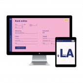
Laround Website by Anna Muratova |
Home > Winners > #97369 |
| CLIENT/STUDIO/BRAND DETAILS | |
 |
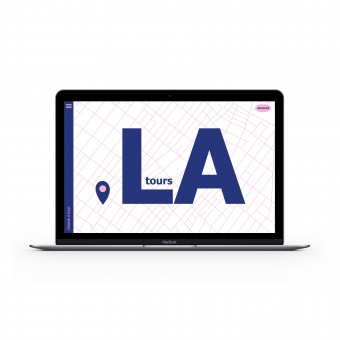
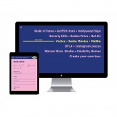
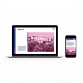
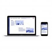
NAME: Anna Muratova PROFILE: Laround tours website is a personal project. The task was to make multi-page website that contain all of the important information and it should be easy to understand. At the same time the website should be visually interesting and different from others. |
| AWARD DETAILS | |
 |
Laround Website by Anna Muratova is Winner in Website and Web Design Category, 2019 - 2020.· Read the interview with designer Anna Muratova for design Laround here.· Press Members: Login or Register to request an exclusive interview with Anna Muratova. · Click here to register inorder to view the profile and other works by Anna Muratova. |
| SOCIAL |
| + Add to Likes / Favorites | Send to My Email | Comment | Testimonials | View Press-Release | Press Kit | Translations |
Did you like Anna Muratova's Web Design?
You will most likely enjoy other award winning web design as well.
Click here to view more Award Winning Web Design.


