DESIGN NAME:
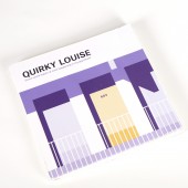
Quirky Louise
PRIMARY FUNCTION:
Book
INSPIRATION:
This project was initiated upon a self-reflection on some of my unique and obsessive habits. For example, I usually get proper amount of food and will eat up every grain of rice to reduce food waste. These habits represent part of my personality. I recorded some statistics, calculated to see the results in a long run and found some shocking facts that can encourage people to take action such as reducing food waste and save water. Then I realized the butterfly effects caused by trivial things could become a warning or encouragement for everyone to benefit the whole world or to simply live a better life.
UNIQUE PROPERTIES / PROJECT DESCRIPTION:
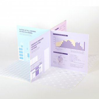
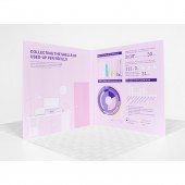
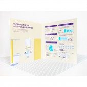
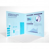
Quirky Louise is a pop-up book introducing the unique living habits of Louise followed by infographics and statistics based on further analysis of each habit. When opened, the book stands up and forms four cubic zones which represent four rooms in Louise house: bathroom, kitchen, living room, and study where the habits typically happen. Illustration on the left side of each "rooms" creates a visual environment, while statistics and graphics on the right show some facts and possible influence.
OPERATION / FLOW / INTERACTION:
Place the book perpendicular to the desktop and open it into a 360 degree structure so that the front and back covers will draw together by magnets and stand stable and upright on desk.
PROJECT DURATION AND LOCATION:
This project started and finished in October 2019 in Baltimore.
FITS BEST INTO CATEGORY:
Graphics, Illustration and Visual Communication Design
|
PRODUCTION / REALIZATION TECHNOLOGY:
For the book Quirky Louise, a classic pop-up structure was adopted to represent rooms at home. On the left side of each "room", an illustration shows the reader which room it is and a title tells about Louise's quirky habit. On the right side, different charts and diagrams analyze the habit and results it may cause in a long run. Different color palettes are employed to distinguish rooms. Stripes of magnetic tape were hided in the front and back covers to close the structure when readers open it.
SPECIFICATIONS / TECHNICAL PROPERTIES:
Closed book: Width 20.3mm x Depth 1.2mm x Height 20.3mm
Opened book:Width 40.6cm x Depth 40.6cm x Height 20.3mm
TAGS:
Book design, illustration, infographics
RESEARCH ABSTRACT:
This project started with a humorous personal topic but ended up in a serious tone. My research started from my daily life. For example, when I wash hands, I damp my hands, turn off the tap, use hand soap, turn on the tap, and clean the tap after use. I noticed that some people would let the tap run when they were applying hand soap, so I wanted to compare the two ways and see how much water I could save or waste. At first, I measured the diameter of my tap and taps of other school buildings to take an average and used stopwatch to calculate the speed and other time durations. After calculating, I found that I saved water and got a number of how much water I could save in one year. Then I measured the water I used to cook a regular bowl of rice to see how many bowls of rice that saved water could cook. Also I researched online to get newly updated numbers about available clean water and other numbers worldwide. Plus, some phone apps also played an important role in number collecting. For the book structure, I checked library pop-up book archive and found a most suitable pop-up structure.
Through this process I realized that even a slight deviation would have huge influence on the results. Getting a completely objective statistic was impossible for this kind of personal projects and what I could do is collecting as many numbers as possible and tried my best to get reasonable data. Some numbers shocked me as well as my friends such as how much water we had wasted by just letting the tap run a few seconds every time when we washed hands. This project thoroughly demonstrates how design and our daily life act on each other.
CHALLENGE:
The first challenge for this project is collecting adequate and accurate statistics since the topic I chose is relatively personal. I tried to gather as much data as possible, such as experimenting with my friends and families. Another big challenge is how to exhibit the numbers so that they can not only convey enough messages but also not too overwhelming. To solve this, I left out some numbers in process and hight the most shocking numbers. For the graphics, choosing best forms of diagram for each topic required careful consideration. Instead of huge complicated diagrams, I used several simple diagrams for one topic to demonstrate different facts. Technically, how to close the book structure was another problem. The traditional structure can be opened 360 degree but the reader has to hold both covers. After trying various ways, I hided thin magnetic tapes in the front and back cover so when they meet each other, they will stick together automatically.
ADDED DATE:
2019-12-07 21:52:35
TEAM MEMBERS (1) :
Yunzi Liu
IMAGE CREDITS:
Image: Yunzi Liu
Photo: Yunzi Liu
|
