Bolgrad Fruit Distillates Distillates Label by Valerii Sumilov |
Home > Winners > #80665 |
 |
|
||||
| DESIGN DETAILS | |||||
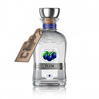
| DESIGN NAME: Bolgrad Fruit Distillates PRIMARY FUNCTION: Distillates Label INSPIRATION: It is worth mentioning that distillates Bolgrad are the discovery of a category of alcoholic products that is new for the Ukrainian market. No other producer of fruit distillates has produced premium class distillates for the Ukrainian market before the Bolgrad company. The design had to be at the same time statutory, premium, stylish, modern and light in perception. The color images used were made exclusively for this project and they should not have interrupted the general restrained style. UNIQUE PROPERTIES / PROJECT DESCRIPTION: The complex branding distillates Bolgrad combines a set of unique characteristics. The design of distillates Bolgrad will solve a number of important marketing tasks, namely to: 1.Clearly identifies the product category. 2.Clearly label each item with an original image. 3.Create a solid, premium product image. 4.Clearl distinguish the product from other strong alcoholic products, such as vodka or gin. 5. Create a new design category and favorably highlight the product on the shelf. OPERATION / FLOW / INTERACTION: This design will undoubtedly catch the eye of the consumers, make them take the bottle in their own hands and examine the design in more detail. Thus, the consumer interacts with the product even before its purchase, which will undoubtedly improve sales. PROJECT DURATION AND LOCATION: The project started in January 2018, in Odessa, Ukraine. Currently, fruit distillates Bolgrad are widely represented on the Ukrainian market and are successfully exported to other countries of the world. FITS BEST INTO CATEGORY: Packaging Design |
PRODUCTION / REALIZATION TECHNOLOGY: Modern print and post-printing technologies were used in this design, such as embossing, stamping and special tactile polish. Printing was executed on high-quality paper, which, combined with the use of a wide range of techniques, made it possible to achieve the perfect vision of the visual design and to deliver pleasant visual and tactile sensations to the customer at direct contact with the product in the store. SPECIFICATIONS / TECHNICAL PROPERTIES: Label dimensions: 116 mm for 80 mm. Label with a complex design. It was executed in such a manner that the left and right edges of the label would go beyond the front side of the bottle and go through the side edges of the square bottle. Instead of a reverse label, an original tag was provided, which is attached to the neck of the bottle with a string. Tag dimensions: 90 mm Х 50 mm. TAGS: Distillate, grappa, packaging design, labels design, branding RESEARCH ABSTRACT: The Agency carried out an extensive research work to prepare for the task of creating brand concepts and the subsequent refinement of the final design version. Different opinions were taken into account and the potential attractiveness and appeal of the product were investigated when using different styles of visual design. As a result, the final choice was an option that optimally reflects the branding concept of the product and the winemaker itself. CHALLENGE: The main goal of this project was to combine the pan-European style of fruit distillates and the actual product position itself, which would be understandable to the Ukrainian consumer. It was necessary to develop a design that, on the one hand, would carry an individual elitist style of high-quality European products, while on the other hand it would clearly convey that these are strong alcoholic distillates. The design had to be at the same time statutory, premium, stylish, modern and light in perception. ADDED DATE: 2019-02-27 17:08:11 TEAM MEMBERS (4) : Creative & art director: Valerii Sumilov, Designer: Valerii Sumilov, Designer: Noizman Val and IMAGE CREDITS: Creative & art director: Valerii Sumilov Designer: Valerii Sumilov Designer: Noizman Val |
||||
| Visit the following page to learn more: http://bit.ly/2KwcfoA | |||||
| AWARD DETAILS | |
 |
Bolgrad Fruit Distillates Distillates Label by Valerii Sumilov is Winner in Packaging Design Category, 2018 - 2019.· Read the interview with designer Valerii Sumilov for design Bolgrad Fruit Distillates here.· Press Members: Login or Register to request an exclusive interview with Valerii Sumilov. · Click here to register inorder to view the profile and other works by Valerii Sumilov. |
| SOCIAL |
| + Add to Likes / Favorites | Send to My Email | Comment | Testimonials | View Press-Release | Press Kit | Translations |
Did you like Valerii Sumilov's Packaging Design?
You will most likely enjoy other award winning packaging design as well.
Click here to view more Award Winning Packaging Design.


