Potemkin Vintage Brandy Bradies Label by Valerii Sumilov |
Home > Winners > #80634 |
 |
|
||||
| DESIGN DETAILS | |||||
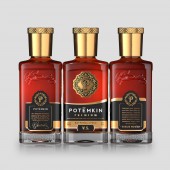
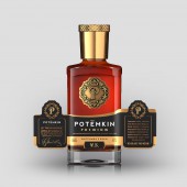
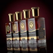
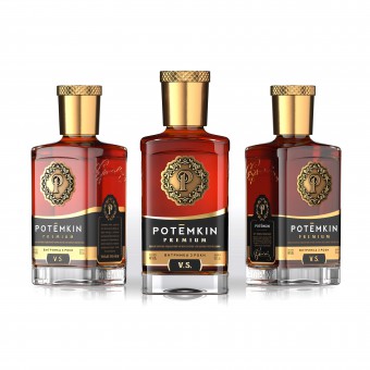
| DESIGN NAME: Potemkin Vintage Brandy PRIMARY FUNCTION: Bradies Label INSPIRATION: The brandy with Potemkin trademark has been available on the Ukrainian market for quite a long time. Potemkin brandy has a wide product range from ordinary to vintage brandy. Our agency has been requested to fulfil a difficult and ambitious task - to comprehensively rebrand the premium segment of Potemkin brandy. The appearance of Potemkin brandy had been recognizable on the market, as it has been bottled in a unique square-shaped bottle. The design of this brandy has also stood out from the general range, as it has been applied directly on the bottle by means of applying the decal + silk-screen printing. UNIQUE PROPERTIES / PROJECT DESCRIPTION: The main goals and objectives of the comprehensive rebranding of the premium brandy POTЁMKIN PREMIUM may be articulated as follows: 1. to develop a brand symbol for the TM POTЁMKIN. 2.to develop a new spelling of the TM POTЁMKIN, which will best reflect the new conceptual positioning of the product. 3.to develop a brand concept that will fully reflect the status and image of the trademark, to highlight profitably the product on the grocery shelf, to cause a positive response from the part of the consumer, and therefore to increase sales of the brandy. OPERATION / FLOW / INTERACTION: The label has a complex structure. In our search, we have found a solution that covers not only the front, but also two lateral sides of the bottle with square section. Thus, the label that is pasted on the bottle covers three sides of the bottle. We have added an additional USP of the product on the lateral sides of the label, thus inviting the consumer not only to examine and study the product, but also to establish a communication between him/her and the brand. PROJECT DURATION AND LOCATION: The project started in autumn 2018, in Kiev, Ukraine. Currently, fruit brandies Potemkin are widely represented on the Ukrainian market. FITS BEST INTO CATEGORY: Packaging Design |
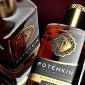
PRODUCTION / REALIZATION TECHNOLOGY: Modern print and post-printing technologies were used in this design, such as embossing, stamping and special tactile polish. Printing was executed on high-quality paper, which, combined with the use of a wide range of techniques, made it possible to achieve the perfect vision of the visual design and to deliver pleasant visual and tactile sensations to the customer at direct contact with the product in the store. SPECIFICATIONS / TECHNICAL PROPERTIES: Label: 190 mm for 66 mm Emblem: 43 mm for 43 mm TAGS: Honey, Vladov, packaging design, labels design, branding RESEARCH ABSTRACT: The branding works carried out resulted in a brand concept, which has been approved by the Customer. It combines a number of unique characteristics that are consistent with the design objective as we have developed: 1. the brand symbol. 2.the unique spelling of the TM. 3.the brand concept of the product design. CHALLENGE: The new design allowed us to solve the issues of the previous design. Specifically, we have replaced the decal on the bottle with a logo made of dense aluminium, which is applied on the front side of the bottle above the label. This is how several issues have been solved at once: 1. the trademark has acquired a recognizable, unique, memorisable brand symbol (logo). 2.the issue of readability of the brand symbol on the bottle has been solved. Now, no matter at what angle the consumer looks at the bottle, he reads the brand symbol equally well and sees the entire design on the bottle. 3.we have developed a design that is equally concise, high status, respectable, expensive in the good sense of the word. ADDED DATE: 2019-02-27 16:56:36 TEAM MEMBERS (3) : Creative & art director: Valerii Sumilov, Designer: Valerii Sumilov and Designer: Noizman Val IMAGE CREDITS: Creative & art director: Valerii Sumilov Designer: Valerii Sumilov Designer: Noizman Val |
||||
| Visit the following page to learn more: http://bit.ly/2X59eNh | |||||
| AWARD DETAILS | |
 |
Potemkin Vintage Brandy Bradies Label by Valerii Sumilov is Winner in Packaging Design Category, 2018 - 2019.· Press Members: Login or Register to request an exclusive interview with Valerii Sumilov. · Click here to register inorder to view the profile and other works by Valerii Sumilov. |
| SOCIAL |
| + Add to Likes / Favorites | Send to My Email | Comment | Testimonials | View Press-Release | Press Kit | Translations |

