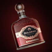
Bolgrad Brandy XO Brandies Label by Valerii Sumilov |
Home > Winners > #80610 |
 |
|
||||
| DESIGN DETAILS | |||||
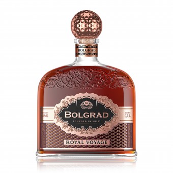
| DESIGN NAME: Bolgrad Brandy XO PRIMARY FUNCTION: Brandies Label INSPIRATION: The inspiration for this project was the product itself. The Bolgrad company is one of the leaders on the alcohol market in Ukraine. Over the years, wines, sparkling wines and brandies of the Bolgrad company have won a reliable reputation with the consumer. And this doesn’t only refer to the content, but also, the external design of the products. The alcoholic products of Bolgrad have always been distinguished by their originality, their dissimilarity to competitors. UNIQUE PROPERTIES / PROJECT DESCRIPTION: The concept successfully combines conflicting messages on the one hand. What did we manage to combine in this project? Just a few elements. On the other hand, we were inspired by the style of classic French colognes. Additionally, we borrowed into the development the style of French brandy. Then we added the current trends from industrial design and engineering and we got this final design. OPERATION / FLOW / INTERACTION: This interesting, exclusive design will undoubtedly catch the eye of the consumers, make them take the bottle in their own hands and examine the design in more detail. Thus, the consumer interacts with the product even before its purchase, which will undoubtedly improve sales. PROJECT DURATION AND LOCATION: The project started in October 2018, in Odessa, Ukraine. At the moment, premium brandies of Bolgrad XO are sold throughout Ukraine in retail and in all major networks. Also, this brandy is successfully exported and begins to conquer its share on the international market. FITS BEST INTO CATEGORY: Packaging Design |
PRODUCTION / REALIZATION TECHNOLOGY: Modern print and post-printing technologies were used in this design, such as embossing, stamping and special tactile polish. Printing was executed on high-quality paper, which, combined with the use of a wide range of techniques, made it possible to achieve the perfect vision of the visual design and to deliver pleasant visual and tactile sensations to the customer at direct contact with the product in the store. SPECIFICATIONS / TECHNICAL PROPERTIES: Label dimensions: 130 mm for 80 mm. The label occupies most of the flask-shaped bottle. The label used special techniques and technologies that give the product a unique tactile and visual effect. As a customer, you will want to take this product into your own hands, touch it with your fingers, feel the effects of the label. TAGS: Cognac, brandy, bolgrad, packaging design, labels design, branding RESEARCH ABSTRACT: The Agency carried out an extensive research work to prepare for the task of creating brand concepts and the subsequent refinement of the final design version. Different opinions were taken into account and the potential attractiveness and appeal of the product were investigated when using different styles of visual design. As a result, the final choice was an option that optimally reflects the branding concept of the product and the winemaker itself. CHALLENGE: We had a difficult task to accomplish. The brand Bolgrad stepped into the premium segment of brandies for the first time. It was necessary not only to preserve and maintain the brand image created over the years, but also to create something new. Something unique to the market. To create a new category, a new trend, a new fashion. The design would have to talk about the exceptional quality of the product. About its special status. About its unique organoleptic properties. ADDED DATE: 2019-02-27 16:34:35 TEAM MEMBERS (4) : Creative & art director: Valerii Sumilov, Designer: Valerii Sumilov, Designer: Noizman Val and IMAGE CREDITS: Creative & art director: Valerii Sumilov Designer: Valerii Sumilov Designer: Noizman Val |
||||
| Visit the following page to learn more: http://bit.ly/2uZuRT9 | |||||
| AWARD DETAILS | |
 |
Bolgrad Brandy Xo Brandies Label by Valerii Sumilov is Winner in Packaging Design Category, 2018 - 2019.· Press Members: Login or Register to request an exclusive interview with Valerii Sumilov. · Click here to register inorder to view the profile and other works by Valerii Sumilov. |
| SOCIAL |
| + Add to Likes / Favorites | Send to My Email | Comment | Testimonials | View Press-Release | Press Kit | Translations |

