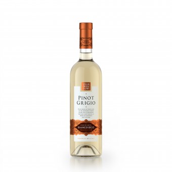
Villa Degli Olma Pinot Grigio Wine Label by Valerii Sumilov |
Home > Winners > #80593 |
 |
|
||||
| DESIGN DETAILS | |||||
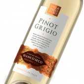
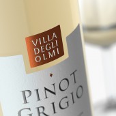
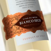
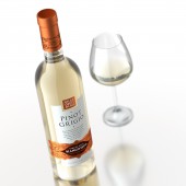
| DESIGN NAME: Villa Degli Olma Pinot Grigio PRIMARY FUNCTION: Wine Label INSPIRATION: The overriding task for agency in this project was the creation of an integral image that would reflect the light and elegant feel of the product, and identify the drink’s region of origin. The unique Italian spirit is contained within every drop of this wine, and that’s exactly what was required to embody in the packaging design. UNIQUE PROPERTIES / PROJECT DESCRIPTION: This particular project compiled a number of innovative solutions in the field of branding and design. First of all, it is a rebranding of an existing product. It is not an easy task to make it better than it was and we truly managed to cope with it. Secondly, developed and implemented a label of complex design features. The label shape conveys the idea of a premium wine. OPERATION / FLOW / INTERACTION: This design will undoubtedly catch the eye of the consumers, make them take the bottle in their own hands and examine the design in more detail. Thus, the consumer interacts with the product even before its purchase, which will undoubtedly improve sales. PROJECT DURATION AND LOCATION: The project started in June 2018, in Moscow, Russia. At the moment, Villa Degli Olma Pinot Grigio wines are represented in the HoReCa of Moscow, in the wineries of the capital. FITS BEST INTO CATEGORY: Packaging Design |
PRODUCTION / REALIZATION TECHNOLOGY: The production of this label involved the application of the most advanced printing techniques. The choice of paper was set to high quality art paper. As for additional printing techniques like to note the application of tactile (volume) varnish not only in the vine’s name but in the author’s signature as well, which ensures the quality of the product. SPECIFICATIONS / TECHNICAL PROPERTIES: Label dimensions: 110 mm for 140 mm. This is a label of a complex, innovative shape. The label uses special post-printing processes. The surface of the label is covered with a super-matte coating, which conveys the effect of a rubberized, velour surface, very pleasant to touch. On such a surface, the effects of embossing and selective tactile polish are very bright and beautiful. TAGS: Wine, Echinoctius, packaging design, labels design, branding RESEARCH ABSTRACT: The Agency carried out an extensive research work to prepare for the task of creating brand concepts and the subsequent refinement of the final design version. Different opinions were taken into account and the potential attractiveness and appeal of the product were investigated when using different styles of visual design. As a result, the final choice was an option that optimally reflects the branding concept of the product and the winemaker itself. CHALLENGE: The solution presented confirms in general lines the traditions of Italian wine packaging, while also carrying certain details that lend the composition a modern and fresh feel. First thing to note is the strict and minimalistic central piece, which serves as a kind of foundation for the more expressive elements located in the lower and upper part of the label respectively. The lower piece also carries stylized illustrations of grapevines, which form a kind of pattern that is repeated in the bottle cap design. The production process for the label involves additional printing and post-printing techniques that emphasize certain elements and make the overall composition more expressive. ADDED DATE: 2019-02-27 16:21:01 TEAM MEMBERS (3) : Creative & art director: Valerii Sumilov, Designer: Valerii Sumilov and Designer: Noizman Val IMAGE CREDITS: Creative & art director: Valerii Sumilov Designer: Valerii Sumilov Designer: Noizman Val |
||||
| Visit the following page to learn more: http://bit.ly/2UPNkjM | |||||
| AWARD DETAILS | |
 |
Villa Degli Olma Pinot Grigio Wine Label by Valerii Sumilov is Winner in Packaging Design Category, 2018 - 2019.· Press Members: Login or Register to request an exclusive interview with Valerii Sumilov. · Click here to register inorder to view the profile and other works by Valerii Sumilov. |
| SOCIAL |
| + Add to Likes / Favorites | Send to My Email | Comment | Testimonials | View Press-Release | Press Kit | Translations |

