Sintagma Premium Wine Wines Label by Valerii Sumilov |
Home > Winners > #80579 |
 |
|
||||
| DESIGN DETAILS | |||||
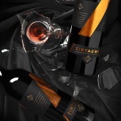
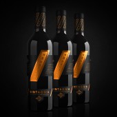
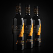
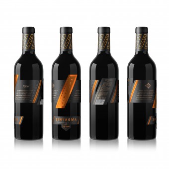
| DESIGN NAME: Sintagma Premium Wine PRIMARY FUNCTION: Wines Label INSPIRATION: The concept is based on the meaning of the linguistic term Sintagma. Sintagma is, to put it simply, a combination of two different parts to make a whole. This term was the best reflection of the concept of this wine. Sintagma wines are a blend of two varieties of red grape varieties matured in high quality oak barrels. These are unique aged wines of limited edition, which required an original, bright, memorable design. UNIQUE PROPERTIES / PROJECT DESCRIPTION: The project of complex branding for Sintagma TM is different from everything else on the food shelf. The concept of the label contains the original idea of the very meaning of Sintagma. In linguistics, this literary tool is symbolized through an inclined dash (/). It was this symbol that laid down the concept as a core element. The label fully emphasizes this idea, smoothly combining, articulating and mixing various elements and parts of a design with this single central concept. OPERATION / FLOW / INTERACTION: The label completely encircles the bottle. This interesting, exclusive design will undoubtedly catch the eye of the consumers, making them take the bottle into their own hands to examine it in more detail. Thus, the consumer interacts with the product even before its purchase, which will certainly boost product sales. PROJECT DURATION AND LOCATION: The project started in April 2018, in Chisinau, Moldova. At the moment, Sintagma wines are present in the Chisinau HoReCa, in the wine boutiques of the capital and in the duty free zone of Chisinau Airport. When departing from Moldova, each visitor of the capital has the opportunity to take away a wonderful souvenir of premium world-class wine. FITS BEST INTO CATEGORY: Packaging Design |
PRODUCTION / REALIZATION TECHNOLOGY: Modern print and post-printing technologies were used in this design, such as embossing, stamping and special tactile polish. Printing was executed on high-quality paper, which, combined with the use of a wide range of techniques, made it possible to achieve the perfect vision of the visual design and to deliver pleasant visual and tactile sensations to the customer at direct contact with the product in the store. SPECIFICATIONS / TECHNICAL PROPERTIES: Label dimensions: 266 mm for 148 mm. The label fully encircles the bottle. At the same time, it is a complex structure that consists of several parts. As a result, when glued on the bottle, the label ensures a continuous consistent single composition, a unique design in which the front and the reverse labels are harmoniously combined. TAGS: Wine, sintagma, packaging design, labels design, branding RESEARCH ABSTRACT: The Agency carried out an extensive research work to prepare for the task of creating brand concepts and the subsequent refinement of the final design version. Different opinions were taken into account and the potential attractiveness and appeal of the product were investigated when using different styles of visual design. As a result, the final choice was an option that optimally reflects the branding concept of the product and the winemaker itself. CHALLENGE: This project was a significant professional challenge for our agency. For more than 10 years we have been working with this winemaker (Sintagma). We have won various international competitions with the designs for this client. And once again, we were required to create such a unique concept, such an exquisite design, which in its aesthetic and conceptual characteristics wouldn’t be inferior to previous successful projects and would even be better than the best of them. ADDED DATE: 2019-02-27 16:05:42 TEAM MEMBERS (3) : Creative & art director: Valerii Sumilov, Designer: Valerii Sumilov and Designer: Noizman Val IMAGE CREDITS: Creative & art director: Valerii Sumilov Designer: Valerii Sumilov Designer: Noizman Val |
||||
| Visit the following page to learn more: http://bit.ly/2Ug7izQ | |||||
| AWARD DETAILS | |
 |
Sintagma Premium Wine Wines Label by Valerii Sumilov is Winner in Packaging Design Category, 2018 - 2019.· Read the interview with designer Valerii Sumilov for design Sintagma Premium Wine here.· Press Members: Login or Register to request an exclusive interview with Valerii Sumilov. · Click here to register inorder to view the profile and other works by Valerii Sumilov. |
| SOCIAL |
| + Add to Likes / Favorites | Send to My Email | Comment | Testimonials | View Press-Release | Press Kit | Translations |
Did you like Valerii Sumilov's Packaging Design?
You will most likely enjoy other award winning packaging design as well.
Click here to view more Award Winning Packaging Design.


