DESIGN NAME:
Michurinsky Prospect
PRIMARY FUNCTION:
Metro Station
INSPIRATION:
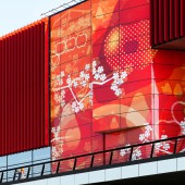
The pattern of blossoming apple trees is dedicated to the famous Russian biologist Michurin. He has created a unique sort of apples. The station is called Michurinsky Prospect in his memory.
The pattern was also inspired by Japanese patterns. The goal was also to create a joyful highlight to the grey suburbian area around the station.
UNIQUE PROPERTIES / PROJECT DESCRIPTION:
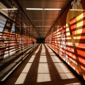
Michurinsky Prospect is a 3 level semi-underground metro station in Moscow. It uses computer pattern and red colour tints through the whole architecture in order to reach the effect with the practical means. Pictures on the faces of the columns and the surfaces of the walls facing the movement of passengers accompany them from the entrance to the subway to boarding the coach, thus forming one visual row in all parts of the structure.
OPERATION / FLOW / INTERACTION:
Due to the peculiarities of the line tracing and the terrain relief, the station is made semi-submerged with a developed ground technological part, vestibule No. 1 integrated into the relief, and an elevated pedestrian crossing leading from the station to the lobby No. 2, which in the future will be combined with one of the vestibules of the third interchange station contour. The width of the pedestrian connection between the station and vestibule No. 2 is designed on the basis of data on passenger traffic.
PROJECT DURATION AND LOCATION:
The station "Michurinsky Prospect" is located in Moscow in living area along the roadway of Michurinsky Prospect near its intersection with Udaltsova Street, from the north-west side of the intersection.
The station was launched in August 2018.
FITS BEST INTO CATEGORY:
Architecture, Building and Structure Design
|
PRODUCTION / REALIZATION TECHNOLOGY:
The station has three levels: on the first level there are tracks and a passenger platform, on the second there is an observation platform, on the third - service and technical premises. Between the lower two levels you can relocate using six escalators in the center of the platform. The observation deck is a panoramic balcony, based on the buttresses and connected with footpaths to a park in the valley of the Ochakovka River. In addition, along the part of the western track wall of the station, there are full height stained glass openings that provide a panoramic view of the park directly from the platform.
The design contains references to the activity of the biologist Ivan Vladimirovich Michurin, in whose honor the avenue was named, which gave the name of the station. The surfaces are decorated with silhouettes of flowering branches and fruits. In the decoration of the station are used granite, glazed ceramics, glass, steel and aluminum. The facade is decorated with the signing “Michurinsky Prospect”, made in three-meter luminous letters, with a total length of 196 m. This signing simultaneously indicates both the name of the station and the name of the avenue on which it is located.
SPECIFICATIONS / TECHNICAL PROPERTIES:
General indicators
Building area - 7089.6 m2;
Total construction area - 19913.0m2;
The total area of the station is 19333.1 m2
including:
the area of the underground part is 6581.3 m2
and surface area - 12751.8 m2;
The total area of open galleries - 579.9 m2;
Construction volume of the building: 133 574.3 m3
including:
the volume of the underground part is 54,396.1 m3;
the volume of the above-ground part is 79 178.2 m3
TAGS:
architecture, metro station, architectural pattern, graphic design,
RESEARCH ABSTRACT:
The research before creating a pattern for the station had two directions. One direction was related to the professional activity of Michurin in order to represent the fruit types he was working on. The other direction was related to the existing monumental graphics for inspiration and patterns in Japanese visual culture. The research regarding architecture was related to investigation of the soil and ground waters in order to define the depth of the station and weight of construction of the levels.
CHALLENGE:
The challenge for the project was to achieve the bright red colour tones in the production of the plates. As far as different materials were used for the different parts of architecture communication with the factories and lots of tests was a big challenge part of the production. Part of the production has taken place on the factories and part in the factories in Holland.
ADDED DATE:
2019-01-08 19:21:02
TEAM MEMBERS (2) :
Architect: Leonid Borzenkov, the head of the architectural studio in AO Metrogiprotrans and Graphic Artist: Ludmila Shurygina, graphic designer
IMAGE CREDITS:
Ludmila Shurygina and Leonid Borzenkov, 2018.
|


