The Pavilia Hill Private Residence by Chiu Chi Ming Danny |
Home > Winners > #69489 |
 |
|
||||
| DESIGN DETAILS | |||||
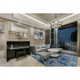
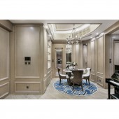
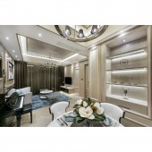
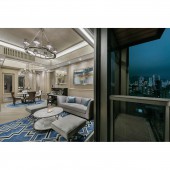
| DESIGN NAME: The Pavilia Hill PRIMARY FUNCTION: Private Residence INSPIRATION: Basically, client requests are clear and straight-forward, both in terms of functionality and aesthetic beauty. As the whole family sharing the same interest-enjoy reading and fond of classical music, the homeowner prefers a beautiful living space with elegant touch which could best reflect their personalities, tastes and lifestyles. Classic elegance interior inspired by sophisticated men's suits is thereby introduced into this 1,324 square feet living space with four inhabitants, and thus generously use of natural material like wood, and the control use of marble provide the ideal setting. UNIQUE PROPERTIES / PROJECT DESCRIPTION: The flat located on the upper floors of high-rise building, with views of downtown in Causeway Bay and Victoria Harbor. The color of this design is mainly with white and a little blue to create a British style and noble feeling. OPERATION / FLOW / INTERACTION: This is a residential apartment of three generation under the same roof. As a family, they love to spend time together, chilling out in the living/ dining area. Thus, the brief was to create a warm and lived-in environment, particularly the dining area to strengthen bonds between family members. As such, designer thoughtfully outfitted the walls with light oak paneling. Not only because of aesthetic beauty-remain the tasteful and elegant ambiance, but also for consistency. PROJECT DURATION AND LOCATION: The project started in and finished in Tin Hau, Hong Kong. FITS BEST INTO CATEGORY: Interior Space and Exhibition Design |
PRODUCTION / REALIZATION TECHNOLOGY: The designer opted for a timeless earth-toned colour scheme. Throughout the apartment, the overall palette remains precise with a widely use of beige, light grey, and strategically populating hues of blue, such as decorative pieces like cushions, carpet placed under the marble coffee table and round dining table in the dining area, thus creating a dialogue with the external cityscape. SPECIFICATIONS / TECHNICAL PROPERTIES: As for the structure, the four bedroom layout was already quite practical for a family of four. However, the dining area is relatively small in proportion, which might lead to a feeling of overstuffed with furniture if a large dining table was chosen. Therefore, improving the unreasonable proportion of the communal zone of the living and dining area is another primary focus. Also, client suggested that the designer could make good use of the unit high ceilings in order to maximize the feeling of spaciousness. TAGS: Reading, classical music, functionality, aesthetic, beauty, lifestyles, spaciousness, mensuits, wood, decoratedpaneling RESEARCH ABSTRACT: This is a residential apartment of three generation under the same roof. As a family, they love to spend time together, chilling out in the living and dining area. Client requests are clear and straight forward, both in terms of functionality and aesthetic beauty. As the whole family sharing the same interest enjoy reading and fond of classical music, the homeowner prefers a beautiful living space with elegant touch which could best reflect their personalities, tastes and lifestyles. CHALLENGE: The dining area is relatively small in proportion, which might lead to a feeling of overstuffed with furniture if a large dining table was chosen. Therefore, improving the unreasonable proportion of the communal zone, the living and dining area is another primary focus. Also, client suggested that the designer could make good use of the unit high ceilings in order to maximize the feeling of spaciousness. ADDED DATE: 2018-06-30 02:47:15 TEAM MEMBERS (1) : IMAGE CREDITS: Chiu Chi Ming Danny, 2018. PATENTS/COPYRIGHTS: Copyrights belong to Chiu Chi Ming Danny, 2018. |
||||
| Visit the following page to learn more: http://bit.ly/2UjpCbT | |||||
| AWARD DETAILS | |
 |
The Pavilia Hill Private Residence by Chiu Chi Ming Danny is Winner in Interior Space and Exhibition Design Category, 2018 - 2019.· Read the interview with designer Chiu Chi Ming Danny for design The Pavilia Hill here.· Press Members: Login or Register to request an exclusive interview with Chiu Chi Ming Danny. · Click here to register inorder to view the profile and other works by Chiu Chi Ming Danny. |
| SOCIAL |
| + Add to Likes / Favorites | Send to My Email | Comment | Testimonials | View Press-Release | Press Kit | Translations |
Did you like Chiu Chi Ming Danny's Interior Design?
You will most likely enjoy other award winning interior design as well.
Click here to view more Award Winning Interior Design.


