Feral Horses Brand Identity Corporate Identity by Emanuele Grittini |
Home > Winners > #65397 |
 |
|
||||
| DESIGN DETAILS | |||||
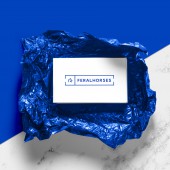
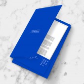
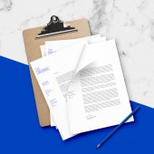
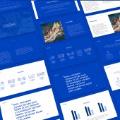
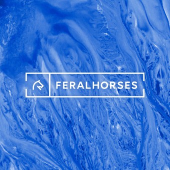
| DESIGN NAME: Feral Horses Brand Identity PRIMARY FUNCTION: Corporate Identity INSPIRATION: The design inspiration is derived in part from the understanding of the values that the client wanted to convey, and partly from the desire to create a strong and unique project in the sector that is inspired by a strong and concrete line to be well defined and recognizable. UNIQUE PROPERTIES / PROJECT DESCRIPTION: The brand has three diverse targets: art enthusiasts, professional traders, and curious achievers. The company operates within the contemporary art investment field. The naming had to express the business vision of freeing art investment. Finally, due to Feral Horses’ mission to mingle the artistic world with the financial one, it was also crucial to come up with a fil rouge that would have brought some harmony and would have balanced creativity and uniqueness with strictness and standards. OPERATION / FLOW / INTERACTION: The interaction with the brand identity takes place in different phases, first of all through the slides that are pro-rated in the various conventions and webinars where the client promotes his activity. Secondly, the customer of the brand, interacts with the brand through corporate materials suitable for promotional use such as folders for documents. Lastly, the users of any type, interact with the social part, specifically designed to be respected in the corporate graphics. PROJECT DURATION AND LOCATION: The project started in October 2016 in Milan and finished in january 2017 in Milan. FITS BEST INTO CATEGORY: Graphics, Illustration and Visual Communication Design |
PRODUCTION / REALIZATION TECHNOLOGY: For the development of the project the practice of "participatory planning" was used, this technique increases the interaction between the designer and the client, making sure to develop a project in a more linear way, sharing the various choices, informing and training the client on the rules and practices that have been followed by case history to better understand the decisions made by the designer. SPECIFICATIONS / TECHNICAL PROPERTIES: All corporate product supports meet ISO standards. The color palette was decided first through the Pantone system and then declined into sRGB for the web and CMYK for cases where printing was impossible via Pantone. The fonts used for the realization of the project are compatible both with printing and with web visualization. The pictogram and the set of variants of the logo are pixel perfect so as to be always recognizable and well distinguishable. TAGS: art, investment, economy, financial, artist, artwork, RESEARCH ABSTRACT: The design was carried out together with the customer to facilitate the understanding of the project, the main objective was the representation in a single pictogram of all the souls of the brand and the sectors in which it operates. Very intense the phase of realization of the logo of the brand, with various proposals to get to the winning one. In addition to satisfying the customer, the result obtained several appreciations and helped the brand achieve its goals. CHALLENGE: The most complex part of the design was to find the right combination between the art and finance sectors. This is because the brand is made up of a team of young professionals willing to show their diversity and the innovation of their project. Furthermore, the naming chosen by the client had to be inserted into a logo that gave the idea of a serious and stable company even if linked to the world of investment in art, so as to give confidence to investors. ADDED DATE: 2018-02-25 13:18:59 TEAM MEMBERS (1) : IMAGE CREDITS: Emanuele Grittini, 2017. |
||||
| Visit the following page to learn more: https://goo.gl/Fi5C5m | |||||
| AWARD DETAILS | |
 |
Feral Horses Brand Identity Corporate Identity by Emanuele Grittini is Winner in Graphics, Illustration and Visual Communication Design Category, 2017 - 2018.· Read the interview with designer Emanuele Grittini for design Feral Horses Brand Identity here.· Press Members: Login or Register to request an exclusive interview with Emanuele Grittini. · Click here to register inorder to view the profile and other works by Emanuele Grittini. |
| SOCIAL |
| + Add to Likes / Favorites | Send to My Email | Comment | Testimonials | View Press-Release | Press Kit |
Did you like Emanuele Grittini's Graphic Design?
You will most likely enjoy other award winning graphic design as well.
Click here to view more Award Winning Graphic Design.


