B-U Campaign and Branding Design by Yu Feng |
Home > Winners > #57531 |
 |
|
||||
| DESIGN DETAILS | |||||
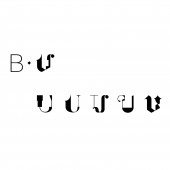
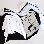
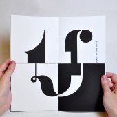
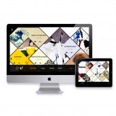
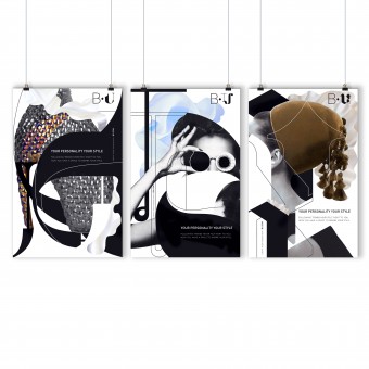
| DESIGN NAME: B-U PRIMARY FUNCTION: Campaign and Branding Design INSPIRATION: Nowadays, more and more people realized fashion puts so much pressure to have all of the latest trends, it teaches young people that clothes and materialistic items are the most important thing. It sends the wrong message that in order to be pretty and popular, you must have the newest outfits and the latest brands. This gives off the impression that personality is not a factor in shaping who you are. The concept of B-U is trying to influence people (the audience), especially teenagers to discover their own sense of style. Be yourself! UNIQUE PROPERTIES / PROJECT DESCRIPTION: B-U is an awareness campaign composed by campaign logo, posters, mail-out items, web banner, and website. It encourages people to follow their own style by empowering individualities. The project utilizes a system based on remixing and collaging pieces together, referencing what is unique about each one of us. OPERATION / FLOW / INTERACTION: From logo design, posters, mail-out items, digital banner to web design, every element is trying to engage the audience to discover their own unique side. The idea of remixing and ever changing was used as a consistent visual element across all of the campaign pieces, for example on the B-U logo the U will change randomly between 5 different 'U' shapes. On the booklet, the design lets the user play with the pages to create their own version of the U by flipping through the 2 sections of the book. The banner is about deconstructing and reshaping the different U shapes by raising the attention when people browsing the Internet. And the website provides a platform for the user to get inspired, save the inspiration stories to the U page, and chose to present how they create their own style or simply become their own fashion diary. Overall, this campaign system units one concept - Your Personality, Your Style. PROJECT DURATION AND LOCATION: The project was completed in December 2016, New York. FITS BEST INTO CATEGORY: Graphics, Illustration and Visual Communication Design |
PRODUCTION / REALIZATION TECHNOLOGY: The B-U logo system is made of different typefaces. The posters are remixing by the fashion images and graphics, and exhibit in bus/train stations. The mail-out poster is printed on Poster Paper and can be folded to mail-out directly. Another mail-out booklet is printed in double sided, folded in the middle and cut into two sections in order to flip the pages horizontally. Web banner is created in After Effects by inputting HTML code. Website is generated by HTML. SPECIFICATIONS / TECHNICAL PROPERTIES: Poster size depends on different display panels, for example the bus stop adverting is 48" W x 69" H. Mail-out poster dimension is 11" W x 17" H, and can be folded and mail it out directly. The dimension of another mail-out booklet is 10" W x 10" H. The web banner is 720 px x 300px. The minimum width of website is 900px. TAGS: Graphic Design, Branding Identity, Visual Communication, Poster Design, Video, Logo Design, Web Design, Design Concept, Collage. RESEARCH ABSTRACT: - CHALLENGE: The challenge is how to create an visual system to engage the audience physically and mentally, in order for them to change something. ADDED DATE: 2017-04-06 01:30:42 TEAM MEMBERS (1) : Yu Feng IMAGE CREDITS: Graphic Design, Art Direction, Video Editing and Prototype Production by Yu Feng. |
||||
| Visit the following page to learn more: http://cargocollective.com/yufeng | |||||
| AWARD DETAILS | |
 |
B-U Campaign and Branding Design by Yu Feng is Winner in Graphics, Illustration and Visual Communication Design Category, 2016 - 2017.· Press Members: Login or Register to request an exclusive interview with Yu Feng . · Click here to register inorder to view the profile and other works by Yu Feng . |
| SOCIAL |
| + Add to Likes / Favorites | Send to My Email | Comment | Testimonials | View Press-Release | Press Kit |

