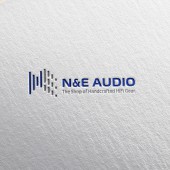
N&E Audio Logo Design Logo by Wai Ching Chan |
Home > Winners > #57039 |
 |
|
||||
| DESIGN DETAILS | |||||
| DESIGN NAME: N&E Audio Logo Design PRIMARY FUNCTION: Logo INSPIRATION: The inspiration for N and E audio logo is from my audio editing experience at film production school in which we have to monitor the sound waveform to adjust the levels and even the speed. That experience helped me to develop the concept at the first stage. Further, I started to do a research about sound waveform. I need a clear and professional presentation to understand the logo quickly. UNIQUE PROPERTIES / PROJECT DESCRIPTION: N, E represent the name of founders Nelson and Edison. So Cloris put the N, E characters and waveform are integrated to create a new logo. Handcrafted HiFi is a unique and professional services provider in Hong Kong. She expected to present a High-end professional brand. Also, she wanted to create a highly relevant with the Brand industry. OPERATION / FLOW / INTERACTION: The first design have nine stripes instead of 8, and more thinner, It's a bit harder to see N and E character, after client comments that I make the stroke more bold, it looks better and cleaner. PROJECT DURATION AND LOCATION: The project started in March 2017 in Hong Kong FITS BEST INTO CATEGORY: Graphics, Illustration and Visual Communication Design |
PRODUCTION / REALIZATION TECHNOLOGY: In the simple eight strokes to design an easy to see the N, E shape, I need to try many times to arrange strokes so that people can easy to understand the meaning of the logo. SPECIFICATIONS / TECHNICAL PROPERTIES: During the design process, I need to combine NE with waveform, and the hardest parts are arranged the stroke look more prominent and easy to read. The first draft I use thinner stroke to present the NE but it look a bit complicated, so I adjust the width of the stroke. TAGS: Logo Design, Branding,Hong Kong, Logo, Icon RESEARCH ABSTRACT: Sound waveform research, Google research CHALLENGE: The primary challenge of this design is mixed abstract waveform and N, E shapes. In the beginning, the client said they like the idea of the logo, but worried people don't understand the meaning of the logo. They tried to make it more like a text font as a standard, I adhere to explain the idea and social perspective to them, and they finally use the logo. ADDED DATE: 2017-03-27 04:34:58 TEAM MEMBERS (1) : Designer: Wai Ching Chan IMAGE CREDITS: Wai Ching Chan, 2016. |
||||
| Visit the following page to learn more: http://goo.gl/c8C7MR | |||||
| AWARD DETAILS | |
 |
N&e Audio Logo Design Logo by Wai Ching Chan is Winner in Graphics, Illustration and Visual Communication Design Category, 2016 - 2017.· Read the interview with designer Wai Ching Chan for design N&E Audio Logo Design here.· Press Members: Login or Register to request an exclusive interview with Wai Ching Chan. · Click here to register inorder to view the profile and other works by Wai Ching Chan. |
| SOCIAL |
| + Add to Likes / Favorites | Send to My Email | Comment | Testimonials | View Press-Release | Press Kit | Translations |
Did you like Wai Ching Chan's Graphic Design?
You will most likely enjoy other award winning graphic design as well.
Click here to view more Award Winning Graphic Design.


