Lambrusco Wine Label Design by ShumiLoveDesign |
Home > Winners > #53254 |
 |
|
||||
| DESIGN DETAILS | |||||
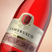
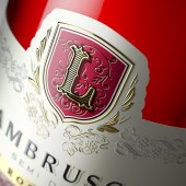
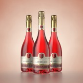
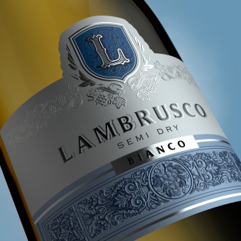
| DESIGN NAME: Lambrusco PRIMARY FUNCTION: Wine Label Design INSPIRATION: The main source of inspiration was the character of the drink itself. Being a light sparkling wine with a refreshing character, we've focused our effort on reflecting this exact feeling in a compelling visual presentation. UNIQUE PROPERTIES / PROJECT DESCRIPTION: The sparkling character of Lambrusco can easily be seen upon the first glimpse of the bottle. The abundance of traditional patterns emphasized by the application of additional post printing processes accentuates the festive and light spirit of the drink. At the same time all the elements presented in this design correspond to the established traditions of Italian sparkling wine package, precisely identifying the product's region of origin. OPERATION / FLOW / INTERACTION: The design creates an airy and light feeling that reflect's the product's main properties and allows to identify its geographic origin. PROJECT DURATION AND LOCATION: April 2014 - October 2014, Moldova FITS BEST INTO CATEGORY: Packaging Design |
PRODUCTION / REALIZATION TECHNOLOGY: Special artistic paper with embossing, foil stamping and tactile varnish. SPECIFICATIONS / TECHNICAL PROPERTIES: label: 120 mm x 90 mm neck collar: 110 mm x 25 mm TAGS: valerii sumilov, shumilovedesign, lambrusco, wine, packaging design, label design, italy RESEARCH ABSTRACT: Connect traditions with modernity, create an image that is precisely in the middle between two opposite trends in packing design - that's exactly what the SHUMI LOVE DESIGN (TM) agency was tasked with during this project. CHALLENGE: It was necessary to locate the fine line where the recognizable character of the traditional Italian sparkling wine package would be presented in a new, more contemporary and attractive way. This became the main goal while developing the design concept. ADDED DATE: 2017-02-08 15:33:03 TEAM MEMBERS (1) : IMAGE CREDITS: ShumiLoveDesign, 2016. |
||||
| Visit the following page to learn more: http://shumilovedesign.eu | |||||
| AWARD DETAILS | |
 |
Lambrusco Wine Label Design by Shumilovedesign is Winner in Packaging Design Category, 2016 - 2017.· Press Members: Login or Register to request an exclusive interview with ShumiLoveDesign. · Click here to register inorder to view the profile and other works by ShumiLoveDesign. |
| SOCIAL |
| + Add to Likes / Favorites | Send to My Email | Comment | Testimonials | View Press-Release | Press Kit | Translations |

