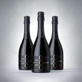
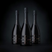
Et Cetera Spumante Wine Label by ShumiLoveDesign |
Home > Winners > #53250 |
 |
|
||||
| DESIGN DETAILS | |||||
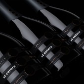
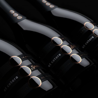
| DESIGN NAME: Et Cetera Spumante PRIMARY FUNCTION: Wine Label INSPIRATION: The visual solution developed by the agency's specialists follows the brand's unique style. At the same time, certain innovations have been introduced in order to make the product truly unique. UNIQUE PROPERTIES / PROJECT DESCRIPTION: The front label consists of three separate bands, each carrying informative elements, connected through the ellipsis sign of the brand logo. OPERATION / FLOW / INTERACTION: The front label attracts attention thanks to its modular structure, consisting of three bands, each carrying specific information. PROJECT DURATION AND LOCATION: September 2016 - December 2016 FITS BEST INTO CATEGORY: Packaging Design |
PRODUCTION / REALIZATION TECHNOLOGY: Special artistic paper with bronze foil stamping SPECIFICATIONS / TECHNICAL PROPERTIES: overall front label: 140 mm x 70 mm front label band: 140 mm x 21 mm back label: 105 mm x 47 mm TAGS: valerii sumilov, et cetera, shumilovedesign, sparkling wine, moldova, packaging, label design RESEARCH ABSTRACT: The visual solution developed by the agency's specialists follows the brand's unique style. At the same time, certain innovations have been introduced in order to make the product truly unique. The common element, of course, is the ellipsis sign, which is common for the brand in general, serves as an eye-stopper and emphasizes the elegance and high level of the trademark. CHALLENGE: For this project the agency has once again acted as a brand developer, expanding the product line according to the common style of the trademark. Moreover, the degree of responsibility was higher in this case, because the client has decided to launch a sparkling wine for the first time in their history. That is why the design had to reflect the importance of this moment, the product's exclusivity, while also retaining the continuity with respect to the already existing product line. ADDED DATE: 2017-02-08 13:56:37 TEAM MEMBERS (1) : IMAGE CREDITS: ShumiLoveDesign, 2016. |
||||
| Visit the following page to learn more: http://shumilovedesign.eu | |||||
| AWARD DETAILS | |
 |
Et Cetera Spumante Wine Label by Shumilovedesign is Winner in Packaging Design Category, 2016 - 2017.· Press Members: Login or Register to request an exclusive interview with ShumiLoveDesign. · Click here to register inorder to view the profile and other works by ShumiLoveDesign. |
| SOCIAL |
| + Add to Likes / Favorites | Send to My Email | Comment | Testimonials | View Press-Release | Press Kit | Translations |

