Et Cetera Premium Wine Label by ShumiLoveDesign |
Home > Winners > #53230 |
 |
|
||||
| DESIGN DETAILS | |||||
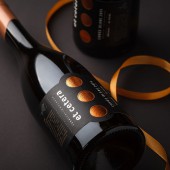
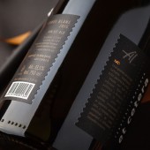
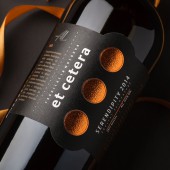
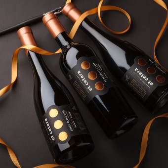
| DESIGN NAME: Et Cetera Premium PRIMARY FUNCTION: Wine Label INSPIRATION: The main step in the brand's renewal was the change in bottle form and an original corking with wax, which make the product stand out and attract the consumer's attention. The label design was also subject to substantial changes. First of all, one should note the new color scheme - black field and bronze elements - that looks temperate, stylish, and gives an instant impression of the product's high level. UNIQUE PROPERTIES / PROJECT DESCRIPTION: The agency's task for this project was to create an original, vivid and attractive design, relevant to the current competitive environment, while retaining the recognizability, the brand's DNA. OPERATION / FLOW / INTERACTION: The label was designed to look and feel like it wraps the bottle around entirely. That's why the front and the back labels have edges styled as perforated pieces, to create the impression of continuity. PROJECT DURATION AND LOCATION: June 2016 - December 2016, Moldova FITS BEST INTO CATEGORY: Packaging Design |
PRODUCTION / REALIZATION TECHNOLOGY: The main step in the brand's renewal was the change in bottle form and an original corking with wax, which make the product stand out and attract the consumer's attention. The label design was also subject to substantial changes. First of all, one should note the new color scheme - black field and bronze elements - that looks temperate, stylish, and gives an instant impression of the product's high level. SPECIFICATIONS / TECHNICAL PROPERTIES: label 1 front: 130 mm x 87 mm, back: 90 mm x 87 mm label 2 front: 120 mm x 96 mm, back: 83 mm x 96 mm TAGS: shumilove, etcetera, wine, label design, packaging design, premium wine, moldova RESEARCH ABSTRACT: This brand was developed by the agency's specialists in 2008 and since then has garnered notoriety both on the domestic and international market. Back at that time, the trademark looked original, premium, and different from everything presented on the product shelves. However, since then the market has seen the introduction of many new players in the signature wine niche, characterized by bright and attractive visuals, which made the Et Cetera brand somewhat lost in the competition. CHALLENGE: The agency's task for this project was to create an original, vivid and attractive design, relevant to the current competitive environment, while retaining the recognizability, the brand's DNA. ADDED DATE: 2017-02-07 18:07:58 TEAM MEMBERS (1) : IMAGE CREDITS: ShumiLoveDesign, 2016. |
||||
| Visit the following page to learn more: http://shumilovedesign.eu | |||||
| AWARD DETAILS | |
 |
Et Cetera Premium Wine Label by Shumilovedesign is Winner in Packaging Design Category, 2016 - 2017.· Press Members: Login or Register to request an exclusive interview with ShumiLoveDesign. · Click here to register inorder to view the profile and other works by ShumiLoveDesign. |
| SOCIAL |
| + Add to Likes / Favorites | Send to My Email | Comment | Testimonials | View Press-Release | Press Kit | Translations |

