Be Like Lettering project by Jenifer Blanco Monzón |
Home > Winners > #52760 |
 |
|
||||
| DESIGN DETAILS | |||||
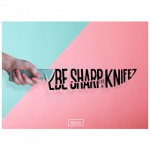
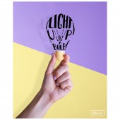
| DESIGN NAME: Be Like PRIMARY FUNCTION: Lettering project INSPIRATION: I get inspired by everything that surrounds me, that is why I try to keep my eyes open and really see. Besides, side projects are an important part of my life because in them, I can really express myself. So I wanted to make a project that made me feel proud and like a true art director, combining all the skills and the knowledge that I have. UNIQUE PROPERTIES / PROJECT DESCRIPTION: This project was created to express my art direction, graphic design, photographic and typographic skills. It was born from the need to create a project unique and colourful. Unique because I combined the conceptual and the design world with the result of a 5 pieces project where each one of them speaks for itself. And Colourful because it was made to catch every eye and to make people feel happy and content by looking at it. OPERATION / FLOW / INTERACTION: I shared this project online and so far it has been a success that I did not expected, in a positive way. I think people can connect to this project because it is not only pretty but because it has content, it has a concept behind it, and it is that you can take the characteristics of an object or a thing and be like it. You can be whatever you like and you can become whoever you like. Some days you can be sweet but some days you need to be clear and sharp. So because it is universal, everybody can relate to this project. PROJECT DURATION AND LOCATION: This project was made on February 2016 in Buenos Aires, Argentina. FITS BEST INTO CATEGORY: Graphics, Illustration and Visual Communication Design |
PRODUCTION / REALIZATION TECHNOLOGY: The realization of this project was wide in skills. I paint the objects and the typography by hand, made the photoshoot in my own studio and retouched the photos using Photoshop. So I went from analog and craft to digital in one single project. SPECIFICATIONS / TECHNICAL PROPERTIES: This project was made mainly for social media and digital communication. There are two kinds of posters, vertical and landscape, and it has a specifically order, so the idea is that the posters' visual flow goes from right to left and back. TAGS: typography, design, color, concept, graphic design, art direction, set design, photoshoot RESEARCH ABSTRACT: I made a research about two topics: typography and set design. I needed to know how could the typography play better with a set design, the colours that worked best and what kind of typography could work better to every poster. Also I needed to be careful with the lights and shadows at the time of the photoshoot. CHALLENGE: This project was quite a challenge because I made it all from scratch. The idea was completely new and unique and I did not wanted to fake it by using only photoshop. I really enjoy crafting and set design, that is why I put all my knowledge and skills into it. ADDED DATE: 2017-01-20 02:52:06 TEAM MEMBERS (1) : IMAGE CREDITS: Image #1: Art Director Jenifer Blanco Monzón, #BeLike, 2016. Optional Image #1: Art Director Jenifer Blanco Monzón, #BeLike, 2016. Optional Image #2: Art Director Jenifer Blanco Monzón, #BeLike, 2016. Optional Image #3: Art Director Jenifer Blanco Monzón, #BeLike, 2016. Optional Image #4: Art Director Jenifer Blanco Monzón, #BeLike, 2016. PATENTS/COPYRIGHTS: Copyrights belong to Jenifer Blanco Monzón, 2017. |
||||
| Visit the following page to learn more: http://www.jenblanco.com | |||||
| AWARD DETAILS | |
 |
Be Like Lettering Project by Jenifer Blanco Monzón is Winner in Graphics, Illustration and Visual Communication Design Category, 2016 - 2017.· Read the interview with designer Jenifer Blanco Monzón for design Be Like here.· Press Members: Login or Register to request an exclusive interview with Jenifer Blanco Monzón. · Click here to register inorder to view the profile and other works by Jenifer Blanco Monzón. |
| SOCIAL |
| + Add to Likes / Favorites | Send to My Email | Comment | Testimonials | View Press-Release | Press Kit |
Did you like Jenifer Blanco Monzón's Graphic Design?
You will most likely enjoy other award winning graphic design as well.
Click here to view more Award Winning Graphic Design.


