Boom-mer-rang Marine Binocular Packaging by Jessie Woo Fernandez - Sicicom |
Home > Winners > #49462 |
 |
|
||||
| DESIGN DETAILS | |||||
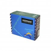
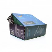
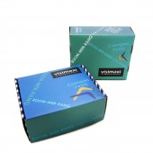
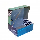
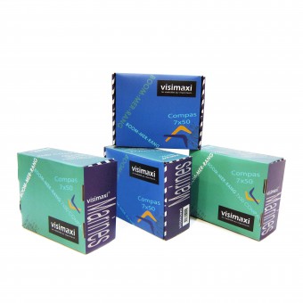
| DESIGN NAME: Boom-mer-rang PRIMARY FUNCTION: Marine Binocular Packaging INSPIRATION: As the design was aimed for marine equipement, my first inspiration came out from the ocean. This idea had led me to explore the blue tone colours with wave movements as elements for replying to this concept. UNIQUE PROPERTIES / PROJECT DESCRIPTION: As a mutuelle box packaging for a product of two significative colours, the Boommerrang design uses wave elements and ocean tones colouring to support, stand out and match up their differences. Contrast but harmoniously together, so as to strengthen and stretching the visual effet when exhibiting the products. OPERATION / FLOW / INTERACTION: My first impression of this project was to stand out the product. Its initial neutral box had no character which brought my thought to change the whole packaging, searching using other materials such as wood, acrylic or plexiglass etc.; But after many researches and considering the factors of higher producing and transporting costs, it came to me the idea of 'simply replacing' its original box. It seemed to me of having more sense of developing' and transforming as if I should emphasize the consonant in a louder sound. I finally kept this idea in my mind that had given birth to the development of this packaging project. When this concept was fully opened as a playground, I had started to combine with different colours, especially blue, green tones, which reminded me of the 'ocean'. To echo this subtle 'tempo' of 'ocean', it was obvious for me to consider 'wave' as the main element which gave evidence to this theme. Trying to place the lines of description differently with movements' as 'waves' to recall back the design theme... Bearing also the idea of creating something matchable for displaying, 'significant but simple' or 'simple but significant'... eye catching 'logo' for better identifying.... The whole design was progressed eventually on this path. PROJECT DURATION AND LOCATION: The project started in april 2014. The first public exhibition took place in September at Cannes Yachting Festival. During two years, the brand keeps on using this packaging. They continue to present them at Paris International boat show in December 2016. FITS BEST INTO CATEGORY: Packaging Design |
PRODUCTION / REALIZATION TECHNOLOGY: Folding box packaging SPECIFICATIONS / TECHNICAL PROPERTIES: Folding packaging with interior printing / Folded dimensions: 240 x 195 x 95 mm TAGS: wave, ocean, blue, green, turquoise, colours, modern, pure line, style, packaging, design, RESEARCH ABSTRACT: It is essentiel to breakthrough tradition binocular packaging and bring out the sense of joy, pleasure despite a relatively 'serious' product. CHALLENGE: Finding out the balance among serious and fun. Coloring and bring out a joyful sense to illustrate the respresenting product so as to give it a strong identity. ADDED DATE: 2016-06-30 15:53:23 TEAM MEMBERS (1) : IMAGE CREDITS: Image #1: Photographer Jessie W. Fernandez, Box design Boomerang-all, 2016. Image #2: Photographer Jessie W. Fernandez, Box design Boomerang-front, 2016. Image #3: Photographer Jessie W. Fernandez, Box design Boomerang-side, 2016. Image #4: Photographer Jessie W. Fernandez, Box design Boomerang-top, 2016. Image #5: Photographer Jessie W. Fernandez, Box design Boomerang-auxilliary, 2016. |
||||
| Visit the following page to learn more: http://www.visimaxi.fr | |||||
| AWARD DETAILS | |
 |
Boom-Mer-Rang Marine Binocular Packaging by Jessie Woo Fernandez-Sicicom is Winner in Packaging Design Category, 2016 - 2017.· Read the interview with designer Jessie Woo Fernandez - Sicicom for design Boom-mer-rang here.· Press Members: Login or Register to request an exclusive interview with Jessie Woo Fernandez - Sicicom. · Click here to register inorder to view the profile and other works by Jessie Woo Fernandez - Sicicom. |
| SOCIAL |
| + Add to Likes / Favorites | Send to My Email | Comment | Testimonials | View Press-Release | Press Kit |
Did you like Jessie Woo Fernandez-Sicicom's Packaging Design?
You will most likely enjoy other award winning packaging design as well.
Click here to view more Award Winning Packaging Design.


