Slade Summer Foundation Exhibition Identity by Daeki Shim, Hyojun Shim |
Home > Winners > #48217 |
 |
|
||||
| DESIGN DETAILS | |||||
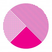
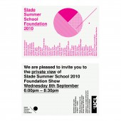
| DESIGN NAME: Slade Summer Foundation PRIMARY FUNCTION: Exhibition Identity INSPIRATION: Point and Line to Plane (Wassily Kandinsky, 1926). I worked on this exhibition identity inspired by summer school course using the most basic concepts on art and design such as point, line and plane. A point make a position in space which mean starting point for learning arts from the course, and a line is an infinite series of points which refer to extend skills and knowledge. Lastly, a plane is a flat surface extending in height and width which represent fulfilled skills and knowledge on artworks. UNIQUE PROPERTIES / PROJECT DESCRIPTION: This is the poster, invitation card and online promotion image for an exhibition identity I designed that was used to promote a fine art exhibition at Slade Summer School 2010 Foundation Show. The theme of this exhibition was related to the point and line to plane. I reduced all the pieces of work to a simple point and line format symbolising the various artist’s work displayed at the exhibition. OPERATION / FLOW / INTERACTION: Viewers are able to be aware of the exhibition information at a glance, and also an inclination of the artists whose works are exhibited. PROJECT DURATION AND LOCATION: This project launched in August 2010 as a promotional poster, invitation card and online promotion image, including and creating an animated visual identity. FITS BEST INTO CATEGORY: Graphics, Illustration and Visual Communication Design |
PRODUCTION / REALIZATION TECHNOLOGY: During the research, I observed the development process of many artists by looking at the thumbnail sketches. The framework steadily came into shape and the work also steadily came to its complete form with the use of Adobe Illustrator and Adobe Effect. SPECIFICATIONS / TECHNICAL PROPERTIES: Poster: W 594 x H 841 mm. Invitation card: W 145 x H 100 mm TAGS: Slade, Foundation, Show, 2010, UCL, University College London RESEARCH ABSTRACT: Basically, this project research was done on the basis of the artworks of those who participated in the exhibition as an artist. I researched into what influence made individual artist creates their works, what inclination of artworks they preferred, and made a design while observing and referring to their works. CHALLENGE: The amusing but difficult point while keeping this work in progress was to symbolize respective works. The most important thing for this symbolization was to observe their work first. Until before the final exhibition started, all works were the one in progressive form, and the work form for yesterday, today and tomorrow frequently developed & changed, which made the symbolization process difficult. ADDED DATE: 2016-03-29 12:14:51 TEAM MEMBERS (1) : Creative Director & Designer: Daeki Shim, Hyojun Shim IMAGE CREDITS: Image #1, 2, 3, 4, 5: Creator Daeki Shim, Hyojun Shim, Slade Summer Foundation, 2015 |
||||
| Visit the following page to learn more: http://www.daandcompany.com | |||||
| AWARD DETAILS | |
 |
Slade Summer Foundation Exhibition Identity by Daeki Shim, Hyojun Shim is Winner in Graphics, Illustration and Visual Communication Design Category, 2015 - 2016.· Press Members: Login or Register to request an exclusive interview with Daeki Shim, Hyojun Shim. · Click here to register inorder to view the profile and other works by Daeki Shim, Hyojun Shim. |
| SOCIAL |
| + Add to Likes / Favorites | Send to My Email | Comment | Testimonials | View Press-Release | Press Kit |


