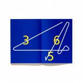
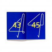
Four & Forty Four Book, Poster, Light by Daeki Shim |
Home > Winners > #48209 |
 |
|
||||
| DESIGN DETAILS | |||||
| DESIGN NAME: Four & Forty Four PRIMARY FUNCTION: Book, Poster, Light INSPIRATION: A taboo word-number 4: Such a superstition applies to national infrastructure. Therefore, this work is a kind of laughing off, and sarcasm. That way, Incheon International Airport welcomes you without Gate No. 4 and 44. UNIQUE PROPERTIES / PROJECT DESCRIPTION: People say that boarding gates four, thirteen, and forty-four do not exist at Incheon International Airport, the busiest gateway to Seoul, which may seem like a rumor, but is true. That the airport authorities refrained from using these four numbers is related to taboos in the East and West. For East Asians, the pronunciation of number four is the same as the word for death, hence the obvious superstition. Similarly, people from the West see thirteen as an ominous number. OPERATION / FLOW / INTERACTION: - PROJECT DURATION AND LOCATION: The project started in June 2015 and finished in November 2015 in Seoul, and was exhibited in Culture Station Seoul 284, Small House Big Door and Doosung Paper Gallery from November 2015 to December 2015 in Seoul. FITS BEST INTO CATEGORY: Graphics, Illustration and Visual Communication Design |
PRODUCTION / REALIZATION TECHNOLOGY: Book (p177-192), Poster, Light SPECIFICATIONS / TECHNICAL PROPERTIES: Book (p177-192): W 150 mm x H 232 mm. Poster: W 1400 mm x H 700 mm. Light: W 570 mm D 120 x H 235 mm. TAGS: Poster, Light, Book, 4, 44, Four, Forty Four, Typojanchi, 2015 RESEARCH ABSTRACT: A taboo word-number 4 is a superstition unique to the cultural area of Chinese characters in East Asia where people consider number 4 to be ominous. CHALLENGE: This work was exhibited in three different forms, i.e. Book, Lighting, and Poster during the same period at three different places. In other words, this work was exhibited in the form of lighting at the main exhibition hall named Cultural Station 284; at hotel named Small House Big Door, this work was produced in a book in the form of a brochure for hotel guests, and in the form of lighting used in a hotel room, and at Doosung Paper Gallery, this work was exhibited in the form of a poster. I used the three different forms of work which commonly correspond to the meaning of the main message of a subject, and used materials and forms which correspond to individually different exhibition halls for manifesting the related idea. ADDED DATE: 2016-03-29 08:13:01 TEAM MEMBERS (1) : Creative Director & Designer: Daeki Shim IMAGE CREDITS: Image #2, 3: Photographer Jinsol Kim, Typojanchi, 2015 Image #4: Photographer Hoseung Lee, 2015 Image #5: Photographer Daeki Shim, Hyojun Shim, 2015 |
||||
| Visit the following page to learn more: http://www.daandcompany.com | |||||
| AWARD DETAILS | |
 |
Four & Forty Four Book, Poster, Light by Daeki Shim is Winner in Graphics, Illustration and Visual Communication Design Category, 2015 - 2016.· Press Members: Login or Register to request an exclusive interview with Daeki Shim . · Click here to register inorder to view the profile and other works by Daeki Shim . |
| SOCIAL |
| + Add to Likes / Favorites | Send to My Email | Comment | Testimonials | View Press-Release | Press Kit |


