Yoshinoya Fast Food Restaurant by AS Design Four Lau and Sam Sum |
Home > Winners > #39655 |
 |
|
||||
| DESIGN DETAILS | |||||
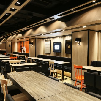
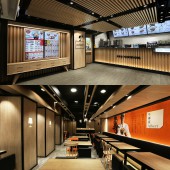
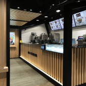
| DESIGN NAME: Yoshinoya PRIMARY FUNCTION: Fast Food Restaurant INSPIRATION: Top House UNIQUE PROPERTIES / PROJECT DESCRIPTION: The main task of the designers is to turn new generation of Yoshinoya’s image from fast food chain into a higher quality brand image, turns the store at the core of the busiest commercial district of Hong Kong into a “Top House”. It represents the brand as top fashion, luxury, avant-garde and premium class with top quality of life, urging the busy pace of urban people to slow down, to enjoy optimized luxurious residential dining environment, spend quality time with friends, in order to deduce a new generation of "a new way of living". Designers emphasized on optimized “lifestyle”, using Japanese minimalist style and a lot of wood finishes, to bring out the Japanese way to pursuit slow pace and coordination, to balance the growing urbanization that destructs human, and to integrate traditional Japanese culture conceptual thinking and minimalistic modern decor taste, to become a new generation optimized dining experience new image qualities of Yoshinoya. OPERATION / FLOW / INTERACTION: Spatial zoning divisions of main lobby and seating area. With simple separation of space, privacy can appear in part of compartments. The dining experience keep causal and relaxed feeling. High malleability and varied house-shaped design elements could link up different zones and makes the interior architecture ambience with congenial Japanese lifestyle. In addition with an imitation roof chimney shaped in different sizes, it successfully become the new focus and hangout spot in the heart of downtown facade. PROJECT DURATION AND LOCATION: The project completed in Feb 2015 in Hong Kong. FITS BEST INTO CATEGORY: Interior Space and Exhibition Design |
PRODUCTION / REALIZATION TECHNOLOGY: Television cabinet styled as electronic menu has become a "living area” focus, by using different house shapes successfully separate service counter and seating area as partitions with a Japanese feel. The main materials: Granite, marble, tiles, glass wooden veneer, stainless steel, powder coating metal, leather, and plastic laminate. SPECIFICATIONS / TECHNICAL PROPERTIES: Area :230 SQM Seating accommodation: 139 Seats TAGS: Yoshinoya, Japanese Fast Food Restaurant, Hong Kong, AS design service ltd, Four Lau , Sam Sum RESEARCH ABSTRACT: Positioned at a rapidly growing market, fast food corporations often targeted at the great ability younger generations. Designers deliberately used the most direct and simple interpretation to demonstrate the image as innovative, apparent, freshness and attractive. With soft lightings, modern wall lamps, flat picture frames, calligraphy that contains unique meaning and casual bar describe the luxurious residential elements, thus shaping the fashion taste and "home" as a primary core brand value. Natural stone doorway matches bright colors, simple lines outline the house. CHALLENGE: The biggest challenge of the project is that, having a long history, the brand’s trademark and main color is well understood by the general public, designers considered the linkage between creative for the brand while keeping the traditional Japanese cultures and to be innovative. This new image element has to be simple, eye catching and easy to understand, while leaving a deep impression and high malleability, varied and interesting. “House in house” design set upon the mood of Chinese courtyard patio space, making a small space to expand suddenly. It adds the fascination of interior architecture; produces an intimate form of a house; Uses the house-shaped wooden structure at the top of the sofa seating area to hide a large number of ventilation and fire systems equipment and pipes (E & M Service). Due to the low building structures, the basic factors in considering functions and aesthetics add relative difficulties to design. ADDED DATE: 2015-02-25 09:08:08 TEAM MEMBERS (1) : Four Lau (Creative Director) , Sam Sum (Art Director) and Ka Him (Assistant Interior Designer) IMAGE CREDITS: Sing Studio by Sum Sing |
||||
| Visit the following page to learn more: http://www.yoshinoya-hk.com/ | |||||
| AWARD DETAILS | |
 |
Yoshinoya Fast Food Restaurant by as Design Four Lau and Sam Sum is Winner in Interior Space and Exhibition Design Category, 2014 - 2015.· Press Members: Login or Register to request an exclusive interview with AS Design Four Lau and Sam Sum. · Click here to register inorder to view the profile and other works by AS Design Four Lau and Sam Sum. |
| SOCIAL |
| + Add to Likes / Favorites | Send to My Email | Comment | Testimonials | View Press-Release | Press Kit |


