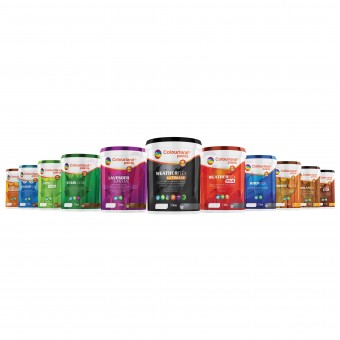
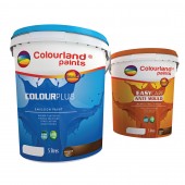
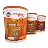
COLOURLAND PAINTS - LIVE UP IN COLOURS Brand New Packaging Design For Paints by JEFFERY YAP |
Home > Winners > #30759 |
| CLIENT/STUDIO/BRAND DETAILS | |
 |
NAME: JEFFERY YAP DESIGN PROFILE: Founded in April 21st 2005 by Designer Jeffery Yap, a Malaysian-born Chinese designer. Apparently he is managing the company in Melbourne, Australia and work with clients from around the world. JEFFERY YAP DESIGN was officially established in 2005 in Malaysia, 2009 in Melbourne, Australia. Our brand moto is to consistently impress clients with unlimited new ideas and consistently pursue for undiscovered talents and possibilities. we also provides clients with world-class and trend-setting design for the years to come. We specialise in Graphic Design, Corporate Identity Design, Interior Design, Exhibition Design, Visual Merchandising, Brand management, Packaging Design and Printing Services. In 2013, we have been awarded by A' Design Award in both Packaging Design and Events and Happenings Design category respectively. |
| AWARD DETAILS | |
 |
Colourland Paints-Live Up in Colours Brand New Packaging Design For Paints by Jeffery Yap is Winner in Packaging Design Category, 2013 - 2014.· Press Members: Login or Register to request an exclusive interview with JEFFERY YAP . · Click here to register inorder to view the profile and other works by JEFFERY YAP . |
| SOCIAL |
| + Add to Likes / Favorites | Send to My Email | Comment | Testimonials | View Press-Release | Press Kit |

