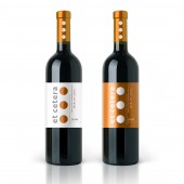
Et Cetera Merlot Exclusive quality wine by Valerii Sumilov |
Home > Winners > #30220 |
 |
|
||||
| DESIGN DETAILS | |||||
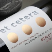
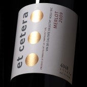
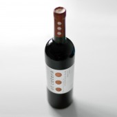
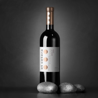
| DESIGN NAME: Et Cetera Merlot PRIMARY FUNCTION: Exclusive quality wine INSPIRATION: On the one hand, we had to create a unique concept, and on the other - to communicate the idea behind the trademark in an effective and original manner. When brainstorming on the idea I came up with the final conceptual solution, the rest was rather simple - choosing the right fonts, outlining the overall aesthetic, picking the post printing techniques to be applied. UNIQUE PROPERTIES / PROJECT DESCRIPTION: The winemakers at Et Cetera approached me with the request of creating a label design for their new line if limited run wines. The task was to create a stylish and minimalistic design that would make the product stand out on the shelves. Assuming that these are expensive quality wines, we also had to create the feeling of exclusivity through an original and unusual design. Besides, the project also required its own product placement, a concept that would be completely different from what the other local winemakers had to offer. OPERATION / FLOW / INTERACTION: The label’s task was to outline this manufacturer's wine from the rest of the offer and be remembered by consumers as something original, interesting and unusual. PROJECT DURATION AND LOCATION: Currently the product is available for purchase in a restaurant chain in Chisinau and several specialized wine shops. FITS BEST INTO CATEGORY: Packaging Design |
PRODUCTION / REALIZATION TECHNOLOGY: The label was printed on self-adhesive paper with the use of metalized paint. SPECIFICATIONS / TECHNICAL PROPERTIES: Label dimensions: 120 mm in length and 90 mm in height. TAGS: Wine, Et Cetera, Ampelos, Valerii, Sumilov, packaging design, labels design RESEARCH ABSTRACT: With the label's seeming simplicity, design's temperance and the limited color scheme this project was certainly a serious task, because it involved the creation of special product positioning for the winemaking company. We had to create a minimalistic, stylish design that would make the product stand out on the shelves. Assuming that these are quality and expensive wines, we also had to communicate the concept of exclusivity through an original and unusual design. CHALLENGE: The most difficult aspect was locating the fine line. On the one hand, we had to create a unique concept, and on the other - to communicate the idea behind the trademark in an effective and original manner. When brainstorming on the idea I came up with the final conceptual solution, the rest was rather simple - choosing the right fonts, outlining the overall aesthetic, picking the post printing techniques to be applied. ADDED DATE: 2013-09-20 01:46:15 TEAM MEMBERS (1) : SHUMI LOVE DESIGN (TM) / Financial Papers printing house, Chisinau, Moldova / Ampelos wine company, Chisinau, Moldova. IMAGE CREDITS: Valerii Sumilov, 2013. |
||||
| Visit the following page to learn more: http://www.shumilovedesign.eu | |||||
| AWARD DETAILS | |
 |
Et Cetera Merlot Exclusive Quality Wine by Valerii Sumilov is Winner in Packaging Design Category, 2013 - 2014.· Press Members: Login or Register to request an exclusive interview with Valerii Sumilov. · Click here to register inorder to view the profile and other works by Valerii Sumilov. |
| SOCIAL |
| + Add to Likes / Favorites | Send to My Email | Comment | Testimonials | View Press-Release | Press Kit |

