DESIGN NAME: Pure
PRIMARY FUNCTION: Seafood Packaging
INSPIRATION: idea:
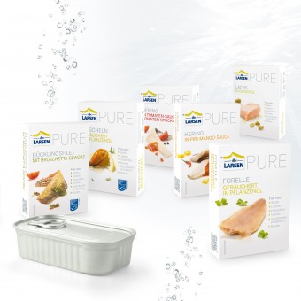
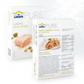
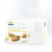
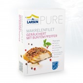
We needed a perfectly clean, almost medical optic and still the maximum of appetite appeal. Dispensing with unnatural additives, lack of lactose and gluten and the important aspect of health (see above) has inspired us to this clear packaging design. In keeping with the wisdom of "less is more" and "form follows function" we decided not to use design elements like overcrowded pictures, loud colors and redundant text statements, even to the printing of the tin.
solution:
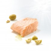
Almost inevitably, we came up with a white box, with Scandinavian borrowings in terms of color and typography and a new photo apprehension in which we have deliberately built some small bugs (oil drippings, crumbs, product shreds) to break through the rigor of the design. We involve the consumer with recipes on the back: wraps, burgers & Co.. All of them extremely easy and fast to make and all made with the original product. All in all relaxed and uncomplicated. Somehow a bit Scandinavian ...
UNIQUE PROPERTIES / PROJECT DESCRIPTION: The concept of this new productrange is "Free from". So we have, to put it simply, created an unusually relaxed design. Typically for tinned seafood are more dark and cluttered packagings, our design is "free from" any optical ballast. On the other hand, the range is also for allergy and food-sensitive people. So it seems almost deliberately some kind of medical.
The sale has just started in january 2012 and is extremely successful. The feedback of the retail business is: "We've been waiting a very long time for a good-looking and well thought concept. The customer will love it".
OPERATION / FLOW / INTERACTION: Design matters.
Wether it's a Display, Salesfolder, fair or degustation stand.
PROJECT DURATION AND LOCATION: Project started in Mai 2012 and finishes in October 2012 in Hamburg, 4 countries have allready ordered, first exhibition will the ESE fair 2013 (european seafood exprobition) in Brussel.
FITS BEST INTO CATEGORY: Packaging Design
|
PRODUCTION / REALIZATION TECHNOLOGY: folding box, 6- colour offset printing, aluminium tin unprinted
SPECIFICATIONS / TECHNICAL PROPERTIES: 80 mm W x 25 mm D x 110 mm H when folded
TAGS: PURE, seafood, fish, mussels, natural, healthy, omega-3, good product, packaging design, ambitious, brand strategy + consulting, branding,
RESEARCH ABSTRACT: the project was carried out without any market research
CHALLENGE: -
ADDED DATE: 2013-02-27 06:08:26
TEAM MEMBERS (4) : Bettina Gabriel, Katrin Neumann, Philipp Wagner and Jana Harzewski
IMAGE CREDITS: Bettina Gabriel, 2012.
|