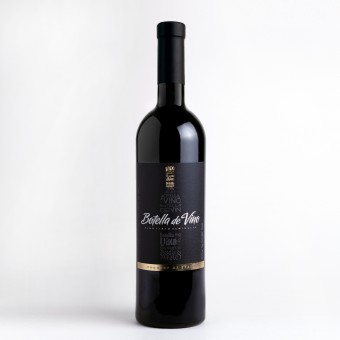
Botella de Vino Series of Spanish wines by Valerii Sumilov |
Home > Winners > #28000 |
 |
|
||||
| DESIGN DETAILS | |||||
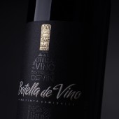
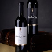
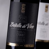
| DESIGN NAME: Botella de Vino PRIMARY FUNCTION: Series of Spanish wines INSPIRATION: I was inspired by the possibility of communicating a complex, voluminous and extensive idea through a minimal and original set of expressive elements. The possibility of using a limited color scheme and put a stronger emphasis on post-printing techniques, starting with the selection of the right paper up to the application of such exquisite techniques as blind and foil stamping. UNIQUE PROPERTIES / PROJECT DESCRIPTION: Spanish wines are traditionally associated with bright, memorable design that employs unusual graphic solutions. This is exactly the task we were given when creating the design for this series of Spanish wines. Besides the design's expressiveness we also had to communicate the very idea behind the trademark: bottle of wine. When working in several directions I have come up with an original solution - to depict a bottle on the label, the contours of which would be made up from various fonts that correspond to the concept of Spanish. As a result the label's design turned into a splendid printing work, which when combined with the trademark became the label's pinnacle. OPERATION / FLOW / INTERACTION: The label's task is to outline the manufacturer's wine from the rest of the competition and be remembered by consumers as something original, interesting and unusual. PROJECT DURATION AND LOCATION: Currently the wine is available for purchase in a supermarket chain in Moscow. FITS BEST INTO CATEGORY: Packaging Design |
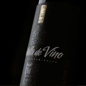
PRODUCTION / REALIZATION TECHNOLOGY: The production of this label involved advanced techniques in the field of printing. The printing was made using quality artistic paper RAFLATAC. Additional techniques include the use of tactile (volume) varnish. Besides, the process also involved the use of such a technique as blind 3D stamping, which created a unique accent in the label’s design in the form of a bottle cap and all the writing embedded into it. SPECIFICATIONS / TECHNICAL PROPERTIES: The label's dimensions are: 90 mm wide and 110 mm high. TAGS: Wine, Botella de Vino, Echinoctius, Valerii, Sumilov, packaging design, labels design RESEARCH ABSTRACT: The creation of this label involved a lot of time. With seemingly simple and temperate design and limited color scheme, this project was a rather complex task with a lot of things at stake - the manufacturer's reputation, the expectations of consumers and the designer's qualification. Using a limited color scheme and putting a stronger accent on using post printing techniques, starting with paper selection to the application of such techniques as blind and foil stamping - it was a tough challenge to find the best solution possible. CHALLENGE: The toughest challenge was locating the fine line. On the one hand, we had to respect the stylistic approach common to Spanish wines, and on the other - to express the trademark's idea in an original and effective manner. When I find the best conceptual solution the rest was quite simple - picking the right fonts, supporting the overall aesthetic and choosing which post printing techniques to apply. ADDED DATE: 2013-02-22 01:35:58 TEAM MEMBERS (1) : SHUMI LOVE DESIGN (TM) / IMPAKS printing house, Riga, Latvia / Satir Club wine company, Moscow, Russia. IMAGE CREDITS: Valerii Sumilov, 2013. |
||||
| Visit the following page to learn more: http://www.shumilovedesign.eu | |||||
| AWARD DETAILS | |
 |
Botella De Vino Series of Spanish Wines by Valerii Sumilov is Winner in Packaging Design Category, 2013 - 2014.· Press Members: Login or Register to request an exclusive interview with Valerii Sumilov. · Click here to register inorder to view the profile and other works by Valerii Sumilov. |
| SOCIAL |
| + Add to Likes / Favorites | Send to My Email | Comment | Testimonials | View Press-Release | Press Kit | Translations |

