5 Elemente Wine Label by Valerii Sumilov |
Home > Winners > #27960 |
 |
|
||||
| DESIGN DETAILS | |||||
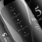
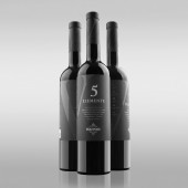
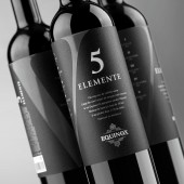
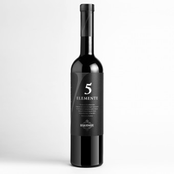
| DESIGN NAME: 5 Elemente PRIMARY FUNCTION: Wine Label INSPIRATION: The main source of inspiration for this project was the major selling point of the product itself - a fine and elegant blend of five distinct wine varieties. This trait provided inspiration for using the stylized Roman number V as the main visual element, which in turn imposed the overall concise and slick style for the entire composition. UNIQUE PROPERTIES / PROJECT DESCRIPTION: The design of 5 Elemente is the result of a project, where the client trusted the design agency with full freedom of expression. The highlight of this design is the Roman character V, which depicts the main idea of the product – five types of wine intertwined in a unique blend. The special paper used for the label as well as the strategic placing of all the graphic elements provoke the potential consumer to take the bottle and spin it in their hands, touch it, which certainly makes a deeper impression and renders the design more memorable. OPERATION / FLOW / INTERACTION: We managed to create the label that stimulates interaction between customer and a product. In order to view all the details - the Roman numeral, percentage of grape sorts, the legend and etc. - customer turns around (rotates) the bottle, interacts with it. Suchlike psychological effect creates subconscious communication - it works much more effective than the bright visual incentives that are usuallyused for attracting customer's attention. PROJECT DURATION AND LOCATION: The project started in April 2012 in Chisinau (Moldova) and finished in October 2012 in Riga (Latvia) FITS BEST INTO CATEGORY: Packaging Design |
PRODUCTION / REALIZATION TECHNOLOGY: High quality paper and tactile varnish used for the label delivers pleasant tactile sensations when handling the bottle. SPECIFICATIONS / TECHNICAL PROPERTIES: - TAGS: 5 elemente, etiketka, 5 elements, wine label, wine package, 5 elemente wine RESEARCH ABSTRACT: - CHALLENGE: There were several major challenges when working on this project. At first, there was the struggle to place all the informative and graphic elements in a way that wouldn`t make the label look overstuffed with details. This led to the concept of a label that would cover the entire flat surface of the bottle instead of using the traditional two-piece layout. This, in turn, resulted in the technological challenge as none of the local printing companies had the ability to print the label as it was intended to. ADDED DATE: 2013-02-21 07:45:45 TEAM MEMBERS (1) : IMAGE CREDITS: Valerii Sumilov, 2012. |
||||
| Visit the following page to learn more: http://etiketka.eu | |||||
| AWARD DETAILS | |
 |
5 Elemente Wine Label by Valerii Sumilov is Winner in Packaging Design Category, 2012 - 2013.· Press Members: Login or Register to request an exclusive interview with Valerii Sumilov. · Click here to register inorder to view the profile and other works by Valerii Sumilov. |
| SOCIAL |
| + Add to Likes / Favorites | Send to My Email | Comment | Testimonials | View Press-Release | Press Kit | Translations |


