World Kids Books Showroom, Retail, Bookstore by Maria Drugoveiko |
Home > Winners > #27933 |
 |
|
||||
| DESIGN DETAILS | |||||
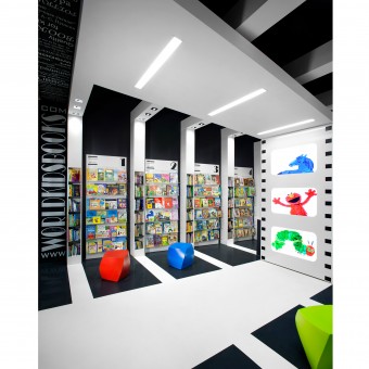
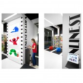
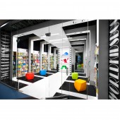
| DESIGN NAME: World Kids Books PRIMARY FUNCTION: Showroom, Retail, Bookstore INSPIRATION: We were inspired by the business idea We used 'an open book' as our design concept UNIQUE PROPERTIES / PROJECT DESCRIPTION: Integration, accessibility and sustainability became the driving forces throughout the whole process. No or low VOC materials were used, energy efficient lighting and TVs, integrated emergency lighting and sprinklers were installed, the space is fully accessible including the existing ceiling. WKB is a great example of how a business idea can be enhanced through interior design. The bold contrast, symmetry, rhythm and pop of color draw people in, and create a dynamic and fun space unlike any other bookstore. OPERATION / FLOW / INTERACTION: The design of this bookstore makes it easy for people to understand the concept behind the idea, to appreciate the openness of the space, to be entertained while at the store yet at the same time not overwhelmed by the digital component and focus on the books. There are many opportunities to shop whether at the store or online. The purpose of the TVs is to attract customers and create a more welcoming atmosphere, to provide customers with information about local events, workshops, new book arrivals, etc., to make shopping for parents with small kids much easier and more comfortable, to be used for marketing purposes. The idea was to connect and to support local communities in the multicultural city through selling children’s books in a variety of languages, for up to 8, and to connect people within those communities. PROJECT DURATION AND LOCATION: Project duration: 3 months from start to finish, completed in July 2012 Project location: Vancouver, BC, Canada FITS BEST INTO CATEGORY: Interior Space and Exhibition Design |
PRODUCTION / REALIZATION TECHNOLOGY: Our focus was not only to meet our clients objectives but to exceed them by creating a sustainable retail environment that supports the original business idea. What makes retail design sustainable? It is not only about the use of the non-toxic materials and energy efficient lighting, it is also about social wellness of its employees and customers, a flexibility and accessibility, and most importantly, we were determined to design the right space for the owners to run a fully operational business using a small footprint. SPECIFICATIONS / TECHNICAL PROPERTIES: Total area: 460 sq ft (42.7 sq m), ceiling height 22 feet (6.7 m) TAGS: Showroom, Retail, Bookstore, Kids, Online store, Interior, Design, Concept, World Kids Books, Red Box ID RESEARCH ABSTRACT: World Kids Books owners approached us with a unique business concept that we needed to research and grasp before proceeding with any design work. The clients wished to have up to 10,000 books in stock, on site. The books would be in 4 different languages with the intent of more languages to be added in the future. Stackable books and lengthy perimeter shelves were not appealing to the clients. Quality books need good design and effective showcasing, was their objective, and we agreed. However, we still faced the challenges of a small space, and a smaller budget. With small book stores closing across Canada due to online competition, we were faced the unique task of how we could use interior design to help this small business prosper. After conducting research and interviews, our mandate was to create a new generation bookstore where the showroom design and experience is the key component, in contrast to dull mass market bookstores and the non experiential online stores. Since it was impossible to showcase 10,000 books on the sales floor at once, we chose to accommodate 2,000 books at one time and rotate in stock from the back room every few weeks. This met the clients needs for inventory, and also kept the customers selection and experience fresh. In addition, customers can view and search all stock while at the store by using a fixed station for browsing the books that are inventoried. CHALLENGE: The biggest challenge was to accommodate a large stock on a small footprint, to showcase products in the best way possible without overstocking the sales area, to integrate a digital component of the business idea (the name of the store is its website), to create an inviting fully accessible space that has many options yet that is not overwhelming for people who shop or work there. ADDED DATE: 2013-02-20 13:54:38 TEAM MEMBERS (2) : Maria Drugoveiko and Simon Spacewalker IMAGE CREDITS: Maria Drugoveiko, 2012. |
||||
| Visit the following page to learn more: http://www.redboxid.com | |||||
| AWARD DETAILS | |
 |
World Kids Books Showroom, Retail, Bookstore by Maria Drugoveiko is Winner in Interior Space and Exhibition Design Category, 2012 - 2013.· Read the interview with designer Maria Drugoveiko for design World Kids Books here.· Press Members: Login or Register to request an exclusive interview with Maria Drugoveiko. · Click here to register inorder to view the profile and other works by Maria Drugoveiko. |
| SOCIAL |
| + Add to Likes / Favorites | Send to My Email | Comment | Testimonials | View Press-Release | Press Kit | Translations |
Did you like Maria Drugoveiko's Interior Design?
You will most likely enjoy other award winning interior design as well.
Click here to view more Award Winning Interior Design.


