Ray Key Visual and Posters Series by Mengyi Xie |
Home > Winners > #162113 |
 |
|
||||
| DESIGN DETAILS | |||||
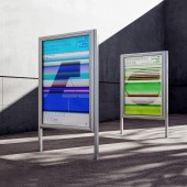
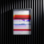
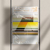
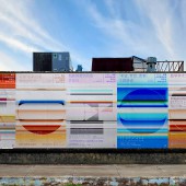
| DESIGN NAME: Ray PRIMARY FUNCTION: Key Visual and Posters Series INSPIRATION: The project was created during the COVID-19 pandemic in China, and its inspiration came from the story of Newton discovering color light in the history of science. In 1665, the Great Plague of the Black Death broke out in England, Newton returned from the University of Cambridge to his small village to continue studying optics. In 1666, Newton used a prism to decompose sunlight into seven colors of ray, and revealed the secret of chromatic light, ending Aristotle's thousand year old common belief that white light is pure monochromatic light and laying the foundation for modern color theory. UNIQUE PROPERTIES / PROJECT DESCRIPTION: This project is the key visual and series poster design for 1st Academic and Cultural Festival for Graduate Students, ECNU. Parallel lines and strong colors have been used to express chromatic light, symbolizing multidimensional collision of ideas, interdisciplinary platforms, rich academic exchanges, and a vibrant cultural community. The "ray" here represents the "ray of academic", "ray of ideological", and "ray of equal", which is a tribute to the scientific exploration spirit of independent thinking and the pursuit of truth. OPERATION / FLOW / INTERACTION: Many key visual billboards have been placed outside and indoors. And there were more than 20 activity posters in the series released on venue and on line. And many posters main layout have been used to the background of ppt on every activities. PROJECT DURATION AND LOCATION: The project was lunched in November 2022 in Shanghai. FITS BEST INTO CATEGORY: Graphics, Illustration and Visual Communication Design |
PRODUCTION / REALIZATION TECHNOLOGY: The projects has been mainly made by Adobe's software, PS, AI and AE. SPECIFICATIONS / TECHNICAL PROPERTIES: There were many key visual billboards outside and indoors. Some of them were 3m width and 8m length. And there were more than 20 activity posters in the series. They were showed on line and on venue. TAGS: Posters, Typography, Graphic design RESEARCH ABSTRACT: In color design field, gradient colors theoretically create "order and harmony", making the overall color relationship harmonious. However, in practice, the color harmony of gradual transition is still greatly influenced by different color areas. The color design process of the series of posters explores the relationship between "order harmony" and color area proportion. CHALLENGE: One of the challenges faced by this project was how to handle different gradient colors to come up with a harmony layout of poster. Forming differences in different series of poster layouts while also having clear serialization is another major challenge. ADDED DATE: 2024-05-31 16:34:47 TEAM MEMBERS (1) : Mengyi Xie IMAGE CREDITS: Mengyi Xie PATENTS/COPYRIGHTS: Mengyi Xie |
||||
| Visit the following page to learn more: https://mp.weixin.qq.com/s/Zv7E7sRscGQco |
|||||
| AWARD DETAILS | |
 |
Ray Key Visual and Posters Series by Mengyi Xie is Winner in Graphics, Illustration and Visual Communication Design Category, 2024 - 2025.· Read the interview with designer Mengyi Xie for design Ray here.· Press Members: Login or Register to request an exclusive interview with Mengyi Xie. · Click here to register inorder to view the profile and other works by Mengyi Xie. |
| SOCIAL |
| + Add to Likes / Favorites | Send to My Email | Comment | Testimonials | View Press-Release | Press Kit |
Did you like Mengyi Xie's Graphic Design?
You will most likely enjoy other award winning graphic design as well.
Click here to view more Award Winning Graphic Design.


