Siviano Italian Wine by Valerii Sumilov |
Home > Winners > #151378 |
 |
|
||||
| DESIGN DETAILS | |||||
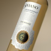
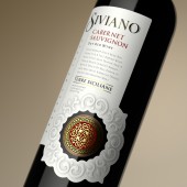
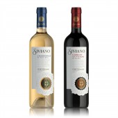
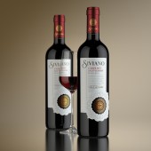
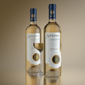
| DESIGN NAME: Siviano PRIMARY FUNCTION: Italian Wine INSPIRATION: The solution presented confirms in general lines the traditions of Italian wine packaging, while also carrying certain details that lend the composition a modern and fresh feel. First thing to note is the strict and minimalistic central piece, which serves as a kind of foundation for the more expressive elements located in the upper part of the label respectively. UNIQUE PROPERTIES / PROJECT DESCRIPTION: The overriding task for the agency in this project was the creation of an integral image that would reflect the light and elegant feel of the product, and identify the drink’s region of origin. The unique Italian spirit is contained within every drop of this wine, and that’s exactly what was required to embody in the packaging design. OPERATION / FLOW / INTERACTION: The label has a unique form: artistic die-cutting of complex shape is performed. Part of the label is shaped. At the same time, the other part of the label is cut through. A powerful center of attraction is formed. This serves to draw attention to the manufacturer's brand and increases the status of the product. PROJECT DURATION AND LOCATION: The project started in november 2022 in Italy. The product is intended for the European and U.S. markets. FITS BEST INTO CATEGORY: Packaging Design |
PRODUCTION / REALIZATION TECHNOLOGY: Brand concept development, trade mark design, package design. The use of advanced post-printing processes was thoughtfully planned out for the label. Their combination and use won't go unappreciated by the consumer. Paper: Velmart White. Post-print: gold stamping, embossing, tactile varnish SPECIFICATIONS / TECHNICAL PROPERTIES: Label: 86 mm X 145 mm. Paper: Vergé White TAGS: italian, wine, siviano RESEARCH ABSTRACT: We did market research on the competitive shelf. As a result of the research it became clear to us that Italian wines are not only about style, breed and brevity. But also mood, atmosphere, a special "feeling" - feeling and passion. That is what we tried to reflect in the design. CHALLENGE: The production process for the label involves additional printing and post-printing techniques that emphasize certain elements and make the overall composition more expressive. The use of advanced post-printing processes was thoughtfully planned out for the label. Their combination and use won't go unappreciated by the consumer, and on the shelf, the product will draw the attention of the most sophisticated connoisseurs of classic Italian wines. ADDED DATE: 2023-04-04 10:43:28 TEAM MEMBERS (1) : Creative & Design Director: Valerii Sumilov, Designer: Valerii Sumilov and Visualizer: Maxim Kulikov IMAGE CREDITS: Image #1 : Creator Valerii Sumilov / Visualizer Maxim Kulikov Image #2 : Creator Valerii Sumilov / Visualizer Maxim Kulikov Image #3 : Creator Valerii Sumilov / Visualizer Maxim Kulikov Image #4 : Creator Valerii Sumilov / Visualizer Maxim Kulikov Image #5 : Creator Valerii Sumilov / Visualizer Maxim Kulikov PATENTS/COPYRIGHTS: Copyright for all texts, images, designs, logo, website design www.shumilovedesign.eu belong to the company SC "SHLD GRUP" SRL. All rights reserved. © SHUMI LOVE DESIGN™, 2023 © VALERII SUMILOV, 2023 © SHLD GRUP SRL, 2023 |
||||
| Visit the following page to learn more: https://bit.ly/3zsvcz4 | |||||
| AWARD DETAILS | |
 |
Siviano Italian Wine by Valerii Sumilov is Winner in Packaging Design Category, 2022 - 2023.· Press Members: Login or Register to request an exclusive interview with Valerii Sumilov. · Click here to register inorder to view the profile and other works by Valerii Sumilov. |
| SOCIAL |
| + Add to Likes / Favorites | Send to My Email | Comment | Testimonials | View Press-Release | Press Kit | Translations |

