Math Alive Brand Identity by Brand Core - Visang |
Home > Winners > #119111 |
 |
|
||||
| DESIGN DETAILS | |||||
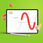
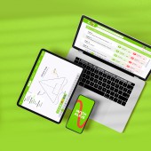
| DESIGN NAME: Math Alive PRIMARY FUNCTION: Brand Identity INSPIRATION: Parabolic graphs from mathematics inspired the logo design. Letter A and V are connected with a continuous line, demonstrating the interaction between an educator and a student. It conveys the message that Math Alive guides users to become masters in math. The key visuals represent the transformation of abstract math concepts into three-dimensional graphics. UNIQUE PROPERTIES / PROJECT DESCRIPTION: Math Alive is an interactive math learning program where abstract math concepts appear as physical objects in a virtual world. The brand aims to teach math more effectively through a digital program where students can touch and experiment with math in material form. The logotype was designed with seamless flowing lines, representing the brand concept of bringing life to the abstract math concepts. OPERATION / FLOW / INTERACTION: Students struggle with math as it becomes more abstract as they advance through school. Math Alive complements such problems with an interactive digital program where students can learn math through digital communications by touching and experimenting with visual aids. The key visuals enrich the UI of the program to engage students in a fun and creative environment of Math Alive. PROJECT DURATION AND LOCATION: The project started in April 2020 and finished in August 2020, in Seoul, South Korea. FITS BEST INTO CATEGORY: Graphics, Illustration and Visual Communication Design |
PRODUCTION / REALIZATION TECHNOLOGY: Math Alive embodies the nature of mathematics and believes math is a language that expresses logic and rational thinking. Designs for Math Alive required conveying these two notions by applying vivid colors and dynamic shapes and lines across the applications. SPECIFICATIONS / TECHNICAL PROPERTIES: Brand identity guideline regulates the logo specifications to ensure legibility and consistency at all times. It comprises the minimum clear space, minimum size, brand color palette, typefaces, and rules for various applications. The aspect ratio of the Math Alive logo constrains as 1.8 to 1. The primary typeface is Gotham font, delivering a compact yet bold style corresponding to the brand concept. TAGS: Brand Identity, Logo, Branding, Visual Identity, Math, Education, Digital, Experience RESEARCH ABSTRACT: The research goal was to find a solution for visualizing the effective technology that Math Alive offers. The design team approached the solution by creating a visual concept of whiz kids expressing themselves through the art of bricolage. The term bricolage is a technique that uses a diverse range of materials similar to the creative and experiential learning method of Math Alive. CHALLENGE: The main task was to organize the visual identity with a fun and approachable mood. However, considering that Math Alive is part of the education business, it was inevitable to reveal its expertise that plays a leading role in the educational technology field. The key was to balance the young and fun setting for the target audience with professionalism as an educational technology brand. ADDED DATE: 2021-02-19 05:45:27 TEAM MEMBERS (2) : Creative Planner: Ji-Hyun Seo and Designer: KyungHye Shin IMAGE CREDITS: Shutterstock, Clipart Korea |
||||
| Visit the following page to learn more: https://global.visang.com/sub/math_alive |
|||||
| AWARD DETAILS | |
 |
Math Alive Brand Identity by Brand Core-Visang is Winner in Graphics, Illustration and Visual Communication Design Category, 2020 - 2021.· Read the interview with designer Brand Core - Visang for design Math Alive here.· Press Members: Login or Register to request an exclusive interview with Brand Core - Visang. · Click here to register inorder to view the profile and other works by Brand Core - Visang. |
| SOCIAL |
| + Add to Likes / Favorites | Send to My Email | Comment | Testimonials | View Press-Release | Press Kit | Translations |
Did you like Brand Core-Visang's Graphic Design?
You will most likely enjoy other award winning graphic design as well.
Click here to view more Award Winning Graphic Design.


