Port Wine Crafting Infographic by Jose Miguel Carvalho Cardoso |
Home > Winners > #109213 |
 |
|
||||
| DESIGN DETAILS | |||||
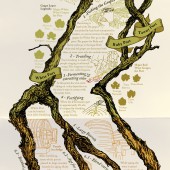
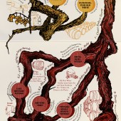
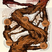
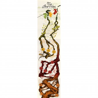
| DESIGN NAME: Port Wine Crafting PRIMARY FUNCTION: Infographic INSPIRATION: This design arises from the observational drawing of the vines. It is this subjective experience of drawing made in 'loco' in the demarcated region of Port Wine in Douro Valley, that allows the designer existential patrimony that captures the spirit of the place. This way, the infographic represents the place of origin of the vineyard, the vineyards itself, the culture and wisdom of producing port wine, loaded with all the empathy inherent to the hand-made drawing. UNIQUE PROPERTIES / PROJECT DESCRIPTION: This infographic offers a detailed and illustrated description of the process of production of Port wine, from picking and treading of the grapes, to the aging of the different types. The drawing of the vineyards is used as a visual metaphor, whose ramifications are developed in different types of Port wine. The aging of the grape varieties is illustrated by the gradual thickening of the vine, until it becomes an old strain. Also is color smart", meeting the Port wine aging, from ruby to tawny. OPERATION / FLOW / INTERACTION: Each of the 5 folds works as a step in the story of Port Wine crafting, allowing a more comfortable use while traveling. The first, is an illustrated postcard of Douro valley with the typical landscape and the common grape colors. The second, describes the process of picking, treading, fermenting, extracting color and fortifying. The third, shows the main types and the aging process of white port. The fourth, shows the aging and the differences from the main types of ruby port. The fifth, shows the continuity of the aging, and examples of the most mythical types of Port wine. PROJECT DURATION AND LOCATION: This project started in December 2018 in Porto city and finnished in March 2019, just in time for the new turistic season. FITS BEST INTO CATEGORY: Graphics, Illustration and Visual Communication Design |
PRODUCTION / REALIZATION TECHNOLOGY: Started with the bservational hand drawing of the grapes with Bic ballpoint Pen. Then, the different grape parts were optimized for vector artwork, using the Ipad and apple pencil. The composition of the infographic tree, as all the complementary illustrations were made with Adobe Illustrator software. Finally the typographic and editorial work was made with Adobe Indesign. SPECIFICATIONS / TECHNICAL PROPERTIES: Open: 148mm x 841mm Folded: 148mm x 168mm Offset four-color print on 120gr matte pearl paper TAGS: Infographic, Port Wine, Douro valley, How to do, Alchemy RESEARCH ABSTRACT: The development of the graphic language was made with observational drawing of Douro Valley Landscapes, the vineyards and bunches of grapes, to capture the sense of the place. That resulted in a graphic grammar which communicates the 'Terroir', but also functional in the infographic reading. Several meetings and brainstorming sessions were held, in order to synthesize all the complexity of an alchemical process, in a simple diagram for a general public. The information was systematized in mind maps and validated by members of the IVDP Institute of Douro and Porto Wines. CHALLENGE: The hardest part of this project was to determin what to communicate. Port wine crafting is a kind of alchemy, with a very tortuous and complex process, in which the winemaker works magic. There are also lots of Port wine types. The challenge was to communicate a simple and inteligible story to the general public, but still keeping the magic of Port wine crafting. ADDED DATE: 2020-08-24 11:32:04 TEAM MEMBERS (3) : Designer: José Miguel cardoso, Wine consultant: Ryan Opaz and Copywriter: Gabriella Opaz IMAGE CREDITS: José Miguel Carvalho Cardoso |
||||
| Visit the following page to learn more: https://bit.ly/2PwLfIJ | |||||
| AWARD DETAILS | |
 |
Port Wine Crafting Infographic by Jose Miguel Carvalho Cardoso is Winner in Graphics, Illustration and Visual Communication Design Category, 2020 - 2021.· Read the interview with designer Jose Miguel Carvalho Cardoso for design Port Wine Crafting here.· Press Members: Login or Register to request an exclusive interview with Jose Miguel Carvalho Cardoso. · Click here to register inorder to view the profile and other works by Jose Miguel Carvalho Cardoso. |
| SOCIAL |
| + Add to Likes / Favorites | Send to My Email | Comment | Testimonials | View Press-Release | Press Kit |
Did you like Jose Miguel Carvalho Cardoso's Graphic Design?
You will most likely enjoy other award winning graphic design as well.
Click here to view more Award Winning Graphic Design.


