| THE AWARD |
| CATEGORIES |
| REGISTRATION |
| SUBMIT YOUR WORK |
| ENTRY INSTRUCTIONS |
| TERMS & CONDITIONS |
| PUBLICATIONS |
| DATES & FEES |
| METHODOLOGY |
| CONTACT |
| WINNERS |
| PRESS ROOM |
| GET INVOLVED |
| DESIGN PRIZE |
| DESIGN STORE |
| THE AWARD | JURY | CATEGORIES | REGISTRATION | PRESS | WINNERS | PUBLICATIONS | ENTRY INSTRUCTIONS |
Twenty Twenty Packaging Design by Panos Tsakiris |
Home > Winners > Design #59498 >Interview |
 |
|
FS: What is the main principle, idea and inspiration behind your design?
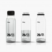
PT: Alcohol slows the pace of communication between neurotransmitters in the brain. The delay in communication between the brain and the eyes means that they are not able to function effectively which weakens the eye muscle coordination. This is what causes distorted or double vision.
FS: What has been your main focus in designing this work? Especially what did you want to achieve?
PT: The main inspiration for this project was the effect alcohol has on the brain and consequently the eyesight. The typeface and graphic elements were created based on this very idea.
FS: What are your future plans for this award winning design?
PT: Unfortunately, it will remain as a concept for the time being.
FS: How long did it take you to design this particular concept?
PT: It took me one month without the iterations.
FS: Why did you design this particular concept? Was this design commissioned or did you decide to pursuit an inspiration?
PT: It was a solution based on a brief for a design competition.
FS: Is your design being produced or used by another company, or do you plan to sell or lease the production rights or do you intent to produce your work yourself?
PT: It is manufactured by the imaginary company Riley and Riley Limited.
FS: What made you design this particular type of work?
PT: The inspiration was the phrase 'twenty twenty vision'.
FS: Where there any other designs and/or designers that helped the influence the design of your work?
PT: Minimalistic and monochromatic designs that my persona liked.
FS: Who is the target customer for his design?
PT: (Sia) Mid-high educated Millenials living in the UK. They like to have a few drinks more than usual every Friday and Saturday. They are working individuals or students.
FS: What sets this design apart from other similar or resembling concepts?
PT: The idea.
FS: How did you come up with the name for this design? What does it mean?
PT: 'Twenty twenty vision'. Noun. Perfect sight, especially as measured by a standard test. The optician told me I had twenty-twenty vision.
FS: Which design tools did you use when you were working on this project?
PT: Adobe Cloud.
FS: What is the most unique aspect of your design?
PT: The before and after effect.
FS: Who did you collaborate with for this design? Did you work with people with technical / specialized skills?
PT: 3dots Visualisation Studio.
FS: What are some of the challenges you faced during the design/realization of your concept?
PT: The deadline and the ethical part of it.
FS: How did you decide to submit your design to an international design competition?
PT: I believed in the idea and was curious about the outcome.
FS: What did you learn or how did you improve yourself during the designing of this work?
PT: I stopped when I could not remove anything else from the design.
FS: Thank you for providing us with this opportunity to interview you.
A' Design Award and Competitions grants rights to press members and bloggers to use parts of this interview. This interview is provided as it is; DesignPRWire and A' Design Award and Competitions cannot be held responsible for the answers given by participating designers.
| SOCIAL |
| + Add to Likes / Favorites | Send to My Email | Comment | View Press-Release |


