Twenty Twenty Packaging Design by Panos Tsakiris |
Home > Winners > #59498 |
 |
|
||||
| DESIGN DETAILS | |||||
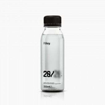
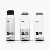
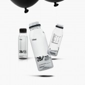
| DESIGN NAME: Twenty Twenty PRIMARY FUNCTION: Packaging Design INSPIRATION: Twenty-twenty vision (noun). perfect sight, especially as measured by a standard test. The main inspiration for this project was the effect alcohol has on the brain and consequently the eyesight. The typeface and graphic elements were created based on this very idea. Specifically, 'alcohol slows the pace of communication between neurotransmitters in the brain. The delay in communication between the brain and the eyes means that they are not able to function effectively which weakens the eye muscle coordination. This is what causes distorted or double vision.' UNIQUE PROPERTIES / PROJECT DESCRIPTION: Brief 'Create a brand for the Riley brothers' drink. You will need to consider everything, from the branding strategy to the design to the packaging.' Riley and Riley Ltd. sell a drink that promises to prevent hangovers. It is a mix of vitamins, rehydration salts, amino acids that break down toxins, caffeine and one secret ingredient. The company was founded by two brothers (Tom and James Riley) from Yorkshire. OPERATION / FLOW / INTERACTION: The process The name of the drink is placed partially on the front (20) and on the back of the bottle label (20). The more the user consumes the more visible the logo gets. When the amount reaches the lowest point, the logo gets clear. This subsequently means the user has absorbed all the required ingredients. The most important thing anyone should do to avoid next day's hangover is to rehydrate. That is the reason why the logo has been placed near the bottom rather than the middle or top of the bottle. The user is 'forced' to drink in order to rehydrate. PROJECT DURATION AND LOCATION: The project started on July 7 and finished on July 31 in London. It is a competition project. FITS BEST INTO CATEGORY: Packaging Design |
PRODUCTION / REALIZATION TECHNOLOGY: Recycled and recyclable plastic (potentially made from recycled spirit labels or bottles). (coca cola case study) SPECIFICATIONS / TECHNICAL PROPERTIES: Width 54mm x Depth 54mm x Height 153mm TAGS: packaging, design, drink, hangover, alcohol RESEARCH ABSTRACT: Target user (audience) Mid to high educated Millenials living in the UK. They like to have a few drinks more than usual every Friday and Saturday. They are working individuals or students. ... before we left the house ... we necked half a bottle of vodka each. Sia Research . Dehydration is one of the main causes of veisalgia symptoms. . Muted (not vivid) colours allow the cortex located in the brain and the retinas in the back of the eye to take a break from being bombarded with color stimulation. CHALLENGE: The ethical part of the project was the biggest challenge. ADDED DATE: 2017-08-17 11:13:17 TEAM MEMBERS (1) : 3Dots Visualisation Studio IMAGE CREDITS: Panos Tsakiris, 2017. |
||||
| Visit the following page to learn more: http://bit.ly/2uLsOEA | |||||
| AWARD DETAILS | |
 |
Twenty Twenty Packaging Design by Panos Tsakiris is Winner in Packaging Design Category, 2017 - 2018.· Press Members: Login or Register to request an exclusive interview with Panos Tsakiris. · Click here to register inorder to view the profile and other works by Panos Tsakiris. |
| SOCIAL |
| + Add to Likes / Favorites | Send to My Email | Comment | Testimonials | View Press-Release | Press Kit |


