| THE AWARD |
| CATEGORIES |
| REGISTRATION |
| SUBMIT YOUR WORK |
| ENTRY INSTRUCTIONS |
| TERMS & CONDITIONS |
| PUBLICATIONS |
| DATES & FEES |
| METHODOLOGY |
| CONTACT |
| WINNERS |
| PRESS ROOM |
| GET INVOLVED |
| DESIGN PRIZE |
| DESIGN STORE |
| THE AWARD | JURY | CATEGORIES | REGISTRATION | PRESS | WINNERS | PUBLICATIONS | ENTRY INSTRUCTIONS |
Visual/Senses Editorial Design by Jesvin Yeo |
Home > Winners > Design #46834 >Interview |
 |
|
FS: What is the main principle, idea and inspiration behind your design?
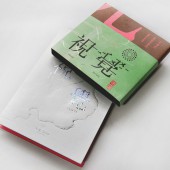
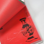
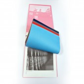
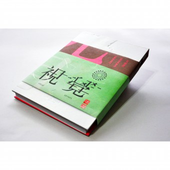
JY: Visual/Senses is an exhibition catalogue, therefore the inspiration is functional as to achieve the aim of the exhibition to recreate the ambience of visiting a temple.
FS: What has been your main focus in designing this work? Especially what did you want to achieve?
JY: Seeing that the actual exhibition is to deliver a blast of nostalgia and familiarity, and a shot of discovery for the younger visitors. This catalogue aims to engage readers through the senses of visual and smell so that memories are evoked; new possibilities are imagined and personal connections are explored.
FS: What are your future plans for this award winning design?
JY: We aim to showcase this award winning design, Visual/Senses, in top-tier exhibitions. The upcoming one is in Taiwan Design Museum.
FS: How long did it take you to design this particular concept?
JY: The main research started in August 2012 and finished in May 2014. The designing process took about 3 months from concept to pagination to production.
FS: Why did you design this particular concept? Was this design commissioned or did you decide to pursuit an inspiration?
JY: It is commissioned by Top Red Art.
FS: What made you design this particular type of work?
JY: We love experimental works as we love to explore with different materials and techniques in graphic and product design. Our studio is called Designing Cultures Studio, therefore we are also very interested to design works that are related to cultures, tradition and heritage.
FS: Who is the target customer for his design?
JY: The target customer are designers who love interesting design, as well as people who are interested or want to know more about traditional decorations of Chinese temples.
FS: What sets this design apart from other similar or resembling concepts?
JY: This design is a unique compared to other resembling design because it is printed with specially created aroma ink to recreate or evoke a certain emotion. No one has do that yet!
FS: How did you come up with the name for this design? What does it mean?
JY: The exhibition is about exploring, employing and experiencing visuals and senses to engage the viewers. We wanted a name that is easy to remember and represent the exhibition well – so Visual/Senses is used as it seems to be the most suitable name to represent the exhibition and this exhibition catalogue.
FS: Which design tools did you use when you were working on this project?
JY: The usual, adobe InDesign and Photoshop.
FS: What is the most unique aspect of your design?
JY: As mentioned earlier, this exhibition catalogue is a unique publication that printed with specially created aroma ink. It is printed therefore the sense should be able to last for years.
FS: Who did you collaborate with for this design? Did you work with people with technical / specialized skills?
JY: We worked with a scent company, Jay Cee Global. The aim is to create a scent that smell like a temple which tightly related to the exhibition theme. The whole process took about five months to complete after experimenting with various natural fragrance materials. Then the essence of the scent was sent to the printer and mixed into the printing inks to print the catalogue.
FS: What are some of the challenges you faced during the design/realization of your concept?
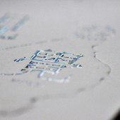
JY: The most challenging part was to find a printer to allow the mixing of the aroma essence into the printing ink, as the concern was the residing of smell on the machine after the printing. Fortunately, we managed to persuade a printer to experiment with the job. Besides the aroma printing ink, 3D Embossing was used to create the smoke effect on the cover. The aim was to create a sculpted effect with a different levels impression. Standard embossing has only one level of impression.
FS: How did you decide to submit your design to an international design competition?
JY: We want to know what is the standard of our design – whether impactful enough to catch the attention of the judges. We also want more people to see our design (if we win).
FS: What did you learn or how did you improve yourself during the designing of this work?
JY: Nothing is impossible if you keep trying. Being resourceful is another key word.
FS: Any other things you would like to cover that have not been covered in these questions?
JY: Thank you to all the judges who appreciate our design.
FS: Thank you for providing us with this opportunity to interview you.
A' Design Award and Competitions grants rights to press members and bloggers to use parts of this interview. This interview is provided as it is; DesignPRWire and A' Design Award and Competitions cannot be held responsible for the answers given by participating designers.
| SOCIAL |
| + Add to Likes / Favorites | Send to My Email | Comment | View Press-Release | Translations |
