| THE AWARD |
| CATEGORIES |
| REGISTRATION |
| SUBMIT YOUR WORK |
| ENTRY INSTRUCTIONS |
| TERMS & CONDITIONS |
| PUBLICATIONS |
| DATES & FEES |
| METHODOLOGY |
| CONTACT |
| WINNERS |
| PRESS ROOM |
| GET INVOLVED |
| DESIGN PRIZE |
| DESIGN STORE |
| THE AWARD | JURY | CATEGORIES | REGISTRATION | PRESS | WINNERS | PUBLICATIONS | ENTRY INSTRUCTIONS |
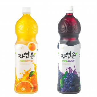
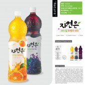
Nature Beverage by Woongjin Food Design Team |
Home > Winners > Design #25396 >Interview |
 |
|
FS: What is the main principle, idea and inspiration behind your design?
WD: Getting out of the existing and generalized mold, the identity of the design was intensified, by placing the symbolic graphic element(tree leaf) in which the core concept of the brand, so that human technology factors are applied into the design in order to provide the consumer convenience. The visual attention was maximized by placing the sizzle expression and logo type harmoniously, which are not artificial, but natural.
FS: What has been your main focus in designing this work? Especially what did you want to achieve?
WD: The design was aimed at competitiveness in the juice product category by securing the package identity of product, which could be obtained through establishment of differentiated design. For this reason, the mold was designed to have a slime waste line, which was differentiated from rectangular or cylindrical shape. And the exquisiteness was raised by the leaf shape on the top, where the fanciness art nouveau decoration was added.
FS: What are your future plans for this award winning design?
WD: In order to save raw cost and protect environment through saving resources, it is being planned to reduce the weight by changing the structure a little, but the design will be maintained.
FS: How long did it take you to design this particular concept?
WD: ‘Nature’ was launched in 2004 as the first native brand in the domestic juice market, which was full of foreign brands. Because there were so many brands based on English language, it took about a year from the naming in Korean language to the completion of differentiated draft graphic. Since then, in 2007, the first renewal was carried Out, in which the sizzle, mold and position of label were applied. And in 2012, the second renewal was carried out for reinforcement and maintenance of brand.
FS: Why did you design this particular concept? Was this design commissioned or did you decide to pursuit an inspiration?
WD: In order to carry out the design in accordance with the brand concept that implies ‘the healthy happiness comes from the nature’, we needed the design which could maximize the customers’ interests by using the appetizing sizzle and exposing the material of product to customers naturally.
FS: Is your design being produced or used by another company, or do you plan to sell or lease the production rights or do you intent to produce your work yourself?
WD: The design and production of mold was planned and adjusted in-house. But the label design was carried out by the outsourcing partner after establishing the concept and direction by the internal department. The ownership, sales and production rights of the design are .fully possessed by Woongjin Food company.
FS: What made you design this particular type of work?
WD: The design and production of mold was planned and adjusted in-house. But the label design was carried out by the outsourcing partner after establishing the concept and direction by the internal department. The ownership, sales and production rights of the design are .fully possessed by Woongjin Food company.
FS: What sets this design apart from other similar or resembling concepts?
WD: There are many designs of beverage container for which the gripping sensibility has been improved, but there are not many designs in which consumers can feel it with five senses as the design is in accordance with the brand concept. The slim waist line of mold helps raise the sensibility. And the aesthetic and practical effect was improved by application of bossed pattern, which is also aimed at preventing glide when grabbed at the top.
FS: How did you come up with the name for this design? What does it mean?
WD: The postposition ‘Eun’, which is used to explain the position of noun in Korean language, was added in the naming, so that the meaning of ‘Eun’, which implies the grace in Chinese character, is attached to ‘Jayeon’ that means the nature. The meaning of the name, which implies ‘grace of health given by the nature’ is Harmonizing with the brand concept as a whole, which runs parallel with the Well-being trend.
FS: Which design tools did you use when you were working on this project?
WD: Rhino 3D, Adobe Illustrator CS5 and Adobe Photoshop CS5 were mainly used.
FS: What is the role of technology in this particular design?
WD: It was required to carry out a special design for a load-bearing product in order to prevent damages during transportation, along with maintaining the aesthetic property. By realizing the twist structure at the waist line of mold, the structural solidity to sustain the weight was considered, while it was easy to grab.
FS: Is your design influenced by data or analytical research in any way? What kind of research did you conduct for making this design?
WD: Working on my personal dissertation titled [Study on Impacts of Package Container Design on Sensitivity of Customers], I decided the direction of design through collecting data, working and correcting the details.
FS: What are some of the challenges you faced during the design/realization of your concept?
WD: I had to face some difficulties in designing the products suitable for mass production and transportation, along with the maintaining the beauty and practicality.
FS: How did you decide to submit your design to an international design competition?
WD: I wanted to receive a favorable evaluation for the brand and design of the product by submitting ‘Jayeoneun’ to the A Award event, which is held in Italy, one of the top-level countries of design industry, and to measure the design preference of the product in the foreign countries before entering the global market.
FS: Any other things you would like to cover that have not been covered in these questions?
WD: I expect many people in the world to meet ‘Jayeoneun’, which is the representative of Korean vegetable juice with quality content as well as the brand concept and design, being sold in various regions.
FS: Thank you for providing us with this opportunity to interview you.
A' Design Award and Competitions grants rights to press members and bloggers to use parts of this interview. This interview is provided as it is; DesignPRWire and A' Design Award and Competitions cannot be held responsible for the answers given by participating designers.
| SOCIAL |
| + Add to Likes / Favorites | Send to My Email | Comment | View Press-Release |


