DESIGN NAME:
Treasure years liquor
PRIMARY FUNCTION:
Liquor
INSPIRATION:
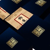
The design demand is to make a high-end liquor, and the target population is successful people, most of them are middle-aged people, tend to be social and have their own understanding of culture. Therefore, the new design is required to have cultural background. The main purpose of the new design is to encourage people to communicate, make friends and awaken people's love for the culture.
UNIQUE PROPERTIES / PROJECT DESCRIPTION:
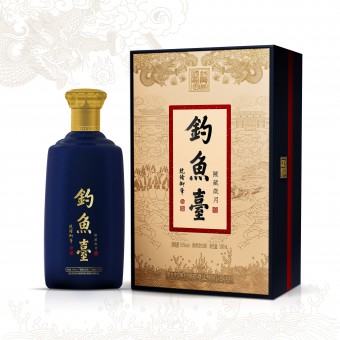
Diao yu tai is a top-ranking liquor brand in China. With a long history,and its own solid and rapid development of course, the client is now a focus of attention in Chinese alcohol market.The product is positioned as a medium and high-end product, which has a certain value of commemoration and collection.
OPERATION / FLOW / INTERACTION:
The creation method of illustration is archaic and has a sense of artistic precipitation. In ancient China, there are not many colors that people can use. Many of them are paintings of the same color system. It is very difficult to use monochromatic tone and modern paper money to complete a painting without losing the sense of history. At first glance, the composition of our illustrations can look symmetrical. Two dragons is explaining our story, but when we carefully observe the details of the illustrations, we can clearly see that we have made subtle changes in the content of the illustrations, making the image more three-dimensional and the art more appreciative.
PROJECT DURATION AND LOCATION:
The project done within 3 months in Shenzhen.
FITS BEST INTO CATEGORY:
Packaging Design
|
PRODUCTION / REALIZATION TECHNOLOGY:
Combining the traditional Chinese element dragon with the modern paper money hand drawing technique, using the modern design language to elaborate the ancient cultural value and resonate with the modern consumers; selecting the paper with the sense of retro to increase the product touch; at the same time, in the process of product firing, how to ensure the coordination of porcelain fission for mass production.
SPECIFICATIONS / TECHNICAL PROPERTIES:
Box:165mmx125mmx270mm,Bottle:500ml
TAGS:
dragon,illustration, graphic design, packaging design, liquor
RESEARCH ABSTRACT:
A lot of online research about the taste has been made before portraying them into the design. As we are aiming to promote the new image of the product amongst the successful person while pushing it to the premium quality, getting rid of the old-fashioned picture. Therefore, we decide to make use of the historical background and organize them with modern aesthetics.
CHALLENGE:
There are many works designed for traditional culture in the market.Therefore our design challenge for this project has put extra attention on to how do we achieve in putting the Treasure years liquor to stands out among other brands. As well as making the packaging rich enough in both design value and usage in order to extend its to a high-end product line.
ADDED DATE:
2020-02-21 02:53:37
TEAM MEMBERS (1) :
Designer:Huang Hai xia,Art direction:Li Yu Chun、He Hong Lin
IMAGE CREDITS:
Hai Xia Huang, 2019.
|
