Old Parr Branding and Redesign by Pierre Delebois - forceMAJEURE Design |
Home > Winners > #99812 |
 |
|
||||
| DESIGN DETAILS | |||||
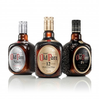
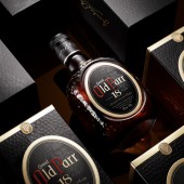
| DESIGN NAME: Old Parr PRIMARY FUNCTION: Branding and Redesign INSPIRATION: Born in Scotland, Old Parr has conquered the warm heart of Latin America where it is a synonym of unpretentious status. Its crackled bottle and iconic tilt are recognized worldwide. Great care was given to retain and enhance the bottle’s tactility. forceMAJEURE Design worked closely with the glassmaker to achieve the organic crackled pattern, elegant on its own when viewed up close. The Olde English typeface and age statement link the brand’s past, but modern printing techniques enhance the label’s depth, character, and tactility. Thomas Parr appears on the front of the bottle with a clever design/printing technique. UNIQUE PROPERTIES / PROJECT DESCRIPTION: forceMAJEURE was tasked to restage the brand, and to redesign the complete range, bringing consistency, elevating and modernizing the look and feel of the pack, and completely redesigning Old Parr 18.The brand world became 2D representation of brand values, elements and personality that can be translated into any medium or 3D space. This became the touchstone for how the brand would develop as the team moved from packaging to advertising, to events and experiences. OPERATION / FLOW / INTERACTION: Old Parr’s crackled bottle and iconic tilt are an important part of the brand's personality. In the bottle design, great care was given to retain and enhance the bottle’s tactility, and its feel in the hand when pouring. The bottles tilt reminds us to always see life from a different perspective and embrace all it has to offer. PROJECT DURATION AND LOCATION: - FITS BEST INTO CATEGORY: Packaging Design |
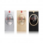
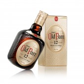
PRODUCTION / REALIZATION TECHNOLOGY: For the Old Parr redesign, forceMAJEURE printed the labels on metallic substrate with white and 6 colors, 2 varnishes and one embossing plate. The boxes are printed on metallic substrate as well. The challenge here was to reproduce the bottle label on the facing and apply a sculpted emboss plate over all the box to reproduce the emblematic Old Parr crackle that the bottle is famous for. SPECIFICATIONS / TECHNICAL PROPERTIES: - TAGS: #rebrand, #productdesign, #packagedesign, #luxury, #whisky, #brownspirits, #oldparr #latinamerica RESEARCH ABSTRACT: - CHALLENGE: The redesign of the Old Parr packaging required special attention. Foremost, the brand needed to be “refreshed,” but still maintain its quirkiness and character. Old Parr’s crackled bottle and iconic tilt are recognized worldwide, and great care was given to retain and enhance the bottle’s tactility. We researched techniques and crackled pattern designs, and worked closely with the glassmaker to achieve the organic crackled pattern, elegant in its own right when viewed up close. It was important to honor the rich history of the brand and Thomas Parr, the man, while infusing modernity into the design. The Old English typeface and age statement link the brand’s past, but modern printing techniques enhance the label’s depth, character, and tactility. The Portrait of Thomas Parr appears on the front of the bottle with a clever design and printing technique that enables him to appear and disappear when viewing the bottle from different angles. ADDED DATE: 2020-02-20 16:24:22 TEAM MEMBERS (4) : Pierre Delebois, Strategy and Creative Director, Tim Devereaux, Art Director, Harry Chong, Product Design Director and Steve Assandri, Production Manager IMAGE CREDITS: Photo Image 1: Taka Igarashi for forceMAJEURE Photo Studio Photo Image 2: Taka Igarashi for forceMAJEURE Photo Studio Photo Image 3: Taka Igarashi for forceMAJEURE Photo Studio Photo Image 4: Taka Igarashi for forceMAJEURE Photo Studio Photo Image 5: Taka Igarashi for forceMAJEURE Photo Studio |
||||
| Visit the following page to learn more: https://www.forcemajeure.design/spiritsa |
|||||
| AWARD DETAILS | |
 |
Old Parr Branding and Redesign by Pierre Delebois-Forcemajeure Design is Winner in Packaging Design Category, 2019 - 2020.· Press Members: Login or Register to request an exclusive interview with Pierre Delebois - forceMAJEURE Design. · Click here to register inorder to view the profile and other works by Pierre Delebois - forceMAJEURE Design. |
| SOCIAL |
| + Add to Likes / Favorites | Send to My Email | Comment | Testimonials | View Press-Release | Press Kit |


