Hak Hi Kong Yong An Harbor Rebranding by Shih Pei, Huang and Chia Lin, Wang |
Home > Winners > #99273 |
 |
|
||||
| DESIGN DETAILS | |||||
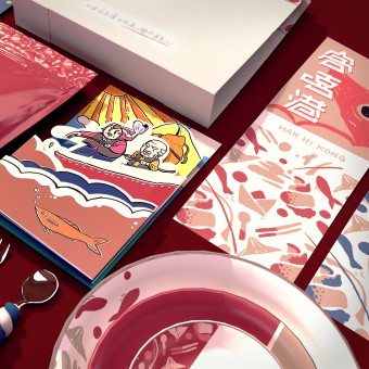
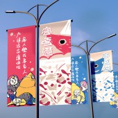
| DESIGN NAME: Hak Hi Kong PRIMARY FUNCTION: Yong An Harbor Rebranding INSPIRATION: Taiwan is an island country owning numerous of ports, and there is only one of them belongs to the Hakka people, the Yong An Fishing Port, which consist of Hui shi Hakka a branch of Hakka and live by the sea, but this fishing port isn’t different of others in Taiwan, and that also is the inspiration source of the proposal creation. The proposal creates a new visual style and concept that only belongs to the Hakka, make it become the truly Hakka’s port for its rich cultural visual identity. UNIQUE PROPERTIES / PROJECT DESCRIPTION: The proposal use three concepts to rebuild the CI system for Yong An Fishing Port. The first is a new logo creating with specific visual material extracted from cultural characteristics of the Hakka community. Next step is a reinvestigation of entertainment experience, then create two mascot characters representing and let them appear in new attractions for guiding tourist into the port. Last but not least, planing nine spots inside, surrounding with entertainment activities and delicious cuisines. OPERATION / FLOW / INTERACTION: - PROJECT DURATION AND LOCATION: - FITS BEST INTO CATEGORY: Graphics, Illustration and Visual Communication Design |
PRODUCTION / REALIZATION TECHNOLOGY: Except for consanguinity, HAK HI KONG will make any guest who playing through the sceneries of the Yong An Fishing Port becomes a Hakka people inadvertently. The meaning of guest and Hakka are same in Traditional Chinese Characters, but represent two different explanations. SPECIFICATIONS / TECHNICAL PROPERTIES: In order to make the new identity color scheme coherent with original colors of existed buildings on the site of Yong An Fishing Port and unifying the whole vision sight, four distinguished color are picked from the surrounding buildings as standard color plan. TAGS: Yong An Fishing Port rebranding and early recreation resource planning RESEARCH ABSTRACT: - CHALLENGE: - ADDED DATE: 2020-02-17 14:38:57 TEAM MEMBERS (1) : Chia Lin,Wang IMAGE CREDITS: Shih Pei, Huang and Chia Lin, Wang, 2019. |
||||
| Visit the following page to learn more: https://www.behance.net/bunny01032ee43 | |||||
| AWARD DETAILS | |
 |
Hak Hi Kong Yong An Harbor Rebranding by Shih Pei, Huang and Chia Lin, Wang is Winner in Graphics, Illustration and Visual Communication Design Category, 2019 - 2020.· Read the interview with designer Shih Pei, Huang and Chia Lin, Wang for design Hak Hi Kong here.· Press Members: Login or Register to request an exclusive interview with Shih Pei, Huang and Chia Lin, Wang. · Click here to register inorder to view the profile and other works by Shih Pei, Huang and Chia Lin, Wang. |
| SOCIAL |
| + Add to Likes / Favorites | Send to My Email | Comment | Testimonials | View Press-Release | Press Kit | Translations |
Did you like Shih Pei, Huang and Chia Lin, Wang's Graphic Design?
You will most likely enjoy other award winning graphic design as well.
Click here to view more Award Winning Graphic Design.


