Holiday Gift Set Packaging by Salvita Bingelyte |
Home > Winners > #99230 |
 |
|
||||
| DESIGN DETAILS | |||||
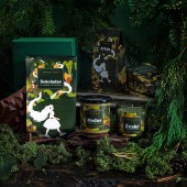
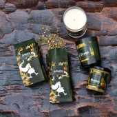
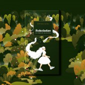
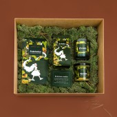
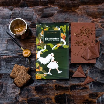
| DESIGN NAME: Holiday Gift Set PRIMARY FUNCTION: Packaging INSPIRATION: Consumable gifts are always a great way to express your appreciation. This holiday gift packaging is inspired by Zemyna, the Lithuanian earth goddess. By giving the land fertility, she protects those who love and care for nature, bringing them abundant harvests and every kind of success. The earth goddess is represented as a Christmas fairy who passes through uncovered fields, magically ripening fruit and inspiring life. UNIQUE PROPERTIES / PROJECT DESCRIPTION: The set includes chocolate, tea, honey, candle, all timeless treats. The earth goddess is a symbol of timeless tradition, but now, she is updated, modern, cool and hip, wearing sneakers and headphones, representing the newest generation that respects the past, but is the future. By uniting tradition and modernity, Zemyna brings the simple pleasures from the earth to the modern lifestyle. Time marches forward, but simple pleasures remain the same. OPERATION / FLOW / INTERACTION: This simple, but memorable product line offers a way to show your client your honest appreciation. The packaging depicts a natural colour palette that reflects the purity of the products ingredients. The chocolate is unconventional because it comes with bread and honey, an unexpected, but interesting natural combination. Although the holiday gift set depicts an atypical Christmas, symbols such as the goddess long white hair serve as a hint to Santa beard, snow and reindeers. PROJECT DURATION AND LOCATION: Started in July and finished in November, 2019 in Vilnius, Lithuania. FITS BEST INTO CATEGORY: Packaging Design |
PRODUCTION / REALIZATION TECHNOLOGY: Offset, flexography and digital printing. SPECIFICATIONS / TECHNICAL PROPERTIES: Gift set contains an 80 g chocolate bar, 40 g herbal tea package, 200 g jar of natural honey and a 140 g cinnamon scented candle. TAGS: Packaging, gift set design, chocolate, tea, honey, candle, design, branding, graphic design, Salvita Design, Lithuania RESEARCH ABSTRACT: Using muted colours, the design conveys the raw position of the brand. As a result, I managed to avoid the traditional Christmas visual cliches and created a unique and memorable packaging design. CHALLENGE: It was very challenging to create a strong and positive illustration. After three months of creating numerous illustrations, changing the goddess and the colours, we finally came up with a pleasing visual juxtaposition between serenity and excitement. ADDED DATE: 2020-02-17 10:18:15 TEAM MEMBERS (1) : IMAGE CREDITS: Salvita Bingelyte (Product stylist) Jurgita Kunigiskyte (Photographer) Erin Hope Stevens (Copywriter) |
||||
| Visit the following page to learn more: https://www.salvita.lt | |||||
| AWARD DETAILS | |
 |
Holiday Gift Set Packaging by Salvita Bingelyte is Winner in Packaging Design Category, 2019 - 2020.· Read the interview with designer Salvita Bingelyte for design Holiday Gift Set here.· Press Members: Login or Register to request an exclusive interview with Salvita Bingelyte. · Click here to register inorder to view the profile and other works by Salvita Bingelyte. |
| SOCIAL |
| + Add to Likes / Favorites | Send to My Email | Comment | Testimonials | View Press-Release | Press Kit |
Did you like Salvita Bingelyte's Packaging Design?
You will most likely enjoy other award winning packaging design as well.
Click here to view more Award Winning Packaging Design.


