The PolyCuboid Office Building by Tetsuya Matsumoto |
Home > Winners > #98976 |
 |
|
||||
| DESIGN DETAILS | |||||
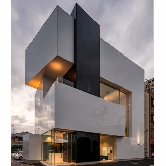
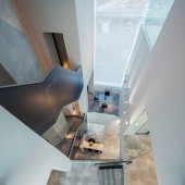
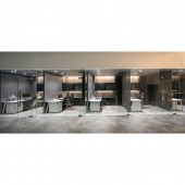
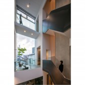
| DESIGN NAME: The PolyCuboid PRIMARY FUNCTION: Office Building INSPIRATION: The PolyCuboid design was inspired by the client initials, TIA, creating the three distinct volumes at first. The design process developed the volumes to the later abstract cuboid forms. The functionality and connection of spaces were inspired by a more dynamic and yet relaxing approach to work that the client want to implement in their headquarter. UNIQUE PROPERTIES / PROJECT DESCRIPTION: The PolyCuboid is the new headquarter office for TIA.co.ltd, a company that provides insurance services. The building is a composition of three imperfect cuboid shapes that interlace to build up the different spaces. The composition further results in an atrium linking the different functions on the different levels and providing the interior with a large amount of natural light. The metallic structure vanishes from the space syntax turning the building into a sculptural object. OPERATION / FLOW / INTERACTION: The entrance gives on to the reception counter, elevator hall and a reception space furnished in sofas and coffee table. A raw of private desks for the employees behind an inside glass facade occupies most of the ground level. The Atrium at the other end connects the three first levels through dynamic resting spaces. the second level is occupied by the CEO office, a meeting room, and booth desks, while the third and forth level includes a gym, a recreational room and a dinning space. PROJECT DURATION AND LOCATION: Project start: September 2017. Construction start: December 2018. Project/Construction End: December 2019. Location: Designed and constructed in Himeji City, Japan. FITS BEST INTO CATEGORY: Architecture, Building and Structure Design |
PRODUCTION / REALIZATION TECHNOLOGY: The building stand on a metallic frame structure for its four levels. The complex geometry of the distinct cuboids and their superposition creating half levels accentuates the complexity of the metallic frame that is concealed inside the invisible parts of the volumes. The exterior wall cladding is a polished composite cement panel called Miraia and produced by Nichiha. The interior finishes vary from wallpaper, tiles, black oxide steel, stainless steel, and many other materials. SPECIFICATIONS / TECHNICAL PROPERTIES: Gross Built Area: 621sqm W20825mm x D13405mm x H18680mm TAGS: Japan, office, insurance, volume, minimalism, interlace, workplace, architecture, atrium RESEARCH ABSTRACT: The interaction between three imperfect cuboid forms can create either an alteration of the form or a nonfunctional architectural space. the alteration happens mostly for technical reasons, such as parapet wall placements, ducts, or simply beam locations. How can space syntax be kept clear while saving the entity of each volume? And what kind of spatial and functional interactions could be created between them? Further, how can a volume identity be kept while using different materials. CHALLENGE: The main challenge of the design was the water service pipe crossing the site underneath in the middle, limiting the construction to half the area, and calling for cantilevered spaces in the upper levels to compensate. Instead of a conventional building with balconies, recovering to the use of interlaced cuboids results in peculiar spaces and connections that needed to be carefully managed. Privacy and interaction together with the daylighting had also major importance in the design process. ADDED DATE: 2020-02-15 07:07:31 TEAM MEMBERS (1) : IMAGE CREDITS: Image #1: photographer ©Stirling Elmendorf, PolyCuboid, 2019. Image #2: photographer ©Stirling Elmendorf, PolyCuboid, 2019. Image #3: photographer ©Stirling Elmendorf, PolyCuboid, 2019. Image #4: photographer ©Stirling Elmendorf, PolyCuboid, 2019. Image #5: photographer ©Stirling Elmendorf, PolyCuboid, 2019. |
||||
| Visit the following page to learn more: http://ktx.space/ | |||||
| AWARD DETAILS | |
 |
The Polycuboid Office Building by Tetsuya Matsumoto is Winner in Architecture, Building and Structure Design Category, 2019 - 2020.· Read the interview with designer Tetsuya Matsumoto for design The PolyCuboid here.· Press Members: Login or Register to request an exclusive interview with Tetsuya Matsumoto. · Click here to register inorder to view the profile and other works by Tetsuya Matsumoto. |
| SOCIAL |
| + Add to Likes / Favorites | Send to My Email | Comment | Testimonials | View Press-Release | Press Kit | Translations |
Did you like Tetsuya Matsumoto's Architecture Design?
You will most likely enjoy other award winning architecture design as well.
Click here to view more Award Winning Architecture Design.


