Superlimao Brand Identity by Ruis Vargas |
Home > Winners > #98423 |
 |
|
||||
| DESIGN DETAILS | |||||
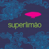
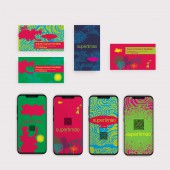
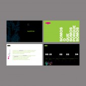
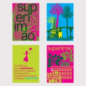
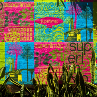
| DESIGN NAME: Superlimao PRIMARY FUNCTION: Brand Identity INSPIRATION: Superlimao is a Brazilian architecture firm. In a plural way, it creates projects based on premises of contemporary architecture, such as respect for the environment, economical and durable productive solutions and furniture. The essence and the creative posture Superlimao, combined with respect for the canons of architecture, was the creative starting point for the development of the universe of representation images and the logo of the new brand. UNIQUE PROPERTIES / PROJECT DESCRIPTION: To represent the aspects of the Superlimao brand, the design of the new logo was inspired by grotesque typography to contrast, by sobriety, with a series of colorful and surreal illustrations and patterns, developed for the language project, enhancing the diversity of visual discourse. Despite the sobriety, the use of the logo allows the deconstruction of its meaning in the interaction with the images, reaffirming the posture of constant reflection on architectural practice. OPERATION / FLOW / INTERACTION: The new brand and its visual identity elements respond to the Superlimao need to renew corporate communication. However, it manages to go further by occupying urban space. On walls and sidings of constructions, the posters function as a manifest, spreading messages and Superlimao's way of understanding architecture and urbanism, and, in addition to identifying the presence of office work by the metropolis, it works as a break from the dominant gray in the landscape of the city of Sao Paulo. PROJECT DURATION AND LOCATION: The project started in February 2019 and finished in June 2019 in Sao Paulo, Brazil. FITS BEST INTO CATEGORY: Graphics, Illustration and Visual Communication Design |
PRODUCTION / REALIZATION TECHNOLOGY: The identity project consists of business cards, printed in 600 g weight, stickers for closing envelopes, institutional presentation and posters. The latter, printed on 75 g offset paper to be glued to walls and sidings, signaling both the entry of the Superlimao headquarters and its works in progress. SPECIFICATIONS / TECHNICAL PROPERTIES: Poster sheet format 420 mm x 620 mm on offset paper 75 g. Printed in 4X0 CMYK colors. Business card format 90 x 50 mm printed on 300 g offset paper, in 4 x 0 CMYK colors, pasted to reach a weight of 600 g. Envelope sticker matte couche 4X0 CMYK colors. TAGS: Brand, poster, logotype, illustration, visual identity, Laika Design RESEARCH ABSTRACT: The Laika method is based on the synergy between linguistic and pictorial skills. Every project begins with the construction of its meaning, an affirmation, and the need to design small graphic narratives. Thus, the brand and its visual identity elements, made by Laika, allow the creation of diverse visual narratives, which contemplate the daily needs of communication and realization of the culture of the Superlimao brand. CHALLENGE: The challenge was to develop a brand and visual language that, besides fulfilling its functional aspects of communication, also represented the Superlimao way of creating and building. In this way, a irreverence and seriousness in the way of making architecture exists, a way that unites apparently antagonistic attitudes. Thus, the language project allows the brand to modulate its behavior, being both sober and expressive, always in function of suitability to the speech and communication context. ADDED DATE: 2020-02-11 00:50:00 TEAM MEMBERS (1) : Ruis Vargas, Creative Director, Agnes Svilenov, Designer IMAGE CREDITS: Laika Design PATENTS/COPYRIGHTS: Laika Design |
||||
| Visit the following page to learn more: http://www.laika.com.br | |||||
| AWARD DETAILS | |
 |
Superlimao Brand Identity by Ruis Vargas is Winner in Graphics, Illustration and Visual Communication Design Category, 2019 - 2020.· Read the interview with designer Ruis Vargas for design Superlimao here.· Press Members: Login or Register to request an exclusive interview with Ruis Vargas. · Click here to register inorder to view the profile and other works by Ruis Vargas. |
| SOCIAL |
| + Add to Likes / Favorites | Send to My Email | Comment | Testimonials | View Press-Release | Press Kit |
| COMMENTS | ||||||||||||||||||||
|
||||||||||||||||||||
Did you like Ruis Vargas' Graphic Design?
You will most likely enjoy other award winning graphic design as well.
Click here to view more Award Winning Graphic Design.


