Status Audio Brand Identity by Ryan Paonessa |
Home > Winners > #98408 |
 |
|
||||
| DESIGN DETAILS | |||||
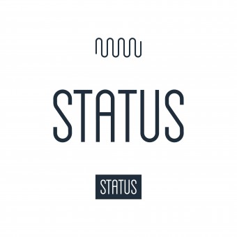
| DESIGN NAME: Status Audio PRIMARY FUNCTION: Brand Identity INSPIRATION: The Status logotype was designed to mimic the flow of a simple sound wave pattern in which each letter follows the same vertical path and arch. This is a subtle nod to the audio components of the brand. The sound wave pattern itself is was also refined to be used as a secondary brand mark in applications where the logo wasn’t necessary. Color and type were used to further unify the brand's visual identity. UNIQUE PROPERTIES / PROJECT DESCRIPTION: Status is a New York-based direct-to-consumer audio brand committed to offering well-designed, high-quality headphones, that reflect a relentless dedication to producing impeccable sound. The Status brief covered a myriad of disciplines including visual identity, product development, packaging design, photography direction, digital design & development, and more. The objective was to create a cohesive identity for the brand that reflected the core ethos of the company and products. OPERATION / FLOW / INTERACTION: Although the Status products do not feature a brand logo, the packaging, website, print collateral, and marketing materials required certain visual mechanisms to help consumers identify the brand. PROJECT DURATION AND LOCATION: This project started in New York in 2015 and is ongoing. The design and development portions have most recently taken place in both New York and Florence, AL. FITS BEST INTO CATEGORY: Graphics, Illustration and Visual Communication Design |
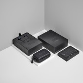
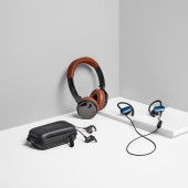
PRODUCTION / REALIZATION TECHNOLOGY: The Status logotype was designed to mimic the flow of a simple sound wave pattern in which each letter follows the same vertical path and arch. Since the space occupied by the logotype and sound wave pattern is almost identical, we were able to leverage this with the packaging. While the headphones themselves do no feature logos, they do each have a unique product code identifier that reflects the minimalist, utilitarian aspects of the brand. SPECIFICATIONS / TECHNICAL PROPERTIES: The packaging shown is offered in a variety of sizes and iterations based on the product. TAGS: graphic design, brand identity, packaging design, logo design, audio, headphones, branding, web design, art direction RESEARCH ABSTRACT: The headphone industry is enormous, with an increasing amount of competitors, all vying to be the next big brand in the space. Status takes a unique, somewhat disruptive approach, in that it focusses on offering high quality sound and design, direct to consumers, at a much more affordable price than their competitors. Part of how they do this is by cutting costs on expensive marketing ploys. From a branding perspective this created a unique challenge — how do you create recognizable products and packaging that represent the brand and product category without excessive supporting material? CHALLENGE: Most of the research regarding the Status branding involved identifying what was being used by other brands in the audio space so that we were able to avoid blending in from a visual perspective. Another tricky aspect of the product was emphasizing the audio components of the brand without being too obvious. For packaging we looked at the products themselves, resulting in very minimal, subtly branded boxes with no excessive imagery or descriptions. ADDED DATE: 2020-02-10 18:38:01 TEAM MEMBERS (4) : Lead Designer: Ryan Paonessa, Founder / CEO: James Bertuzzi, Photographer: Marshall Troy and Photographer: Kilian Son IMAGE CREDITS: Image #2: Photographer Marshall Troy, Product & Packaging Photography, 2019. Image #3: Photographer Marshall Troy, Product & Packaging Photography, 2019. Image #5: Photographer Marshall Troy, Product & Packaging Photography, 2019. |
||||
| Visit the following page to learn more: https://rspny.com/design/ | |||||
| AWARD DETAILS | |
 |
Status Audio Brand Identity by Ryan Paonessa is Winner in Advertising, Marketing and Communication Design Category, 2019 - 2020.· Read the interview with designer Ryan Paonessa for design Status Audio here.· Press Members: Login or Register to request an exclusive interview with Ryan Paonessa. · Click here to register inorder to view the profile and other works by Ryan Paonessa. |
| SOCIAL |
| + Add to Likes / Favorites | Send to My Email | Comment | Testimonials | View Press-Release | Press Kit |
| COMMENTS | ||||||||||||||||||||
|
||||||||||||||||||||
Did you like Ryan Paonessa's Advertising Design?
You will most likely enjoy other award winning advertising design as well.
Click here to view more Award Winning Advertising Design.


