|
|
|

|
|
| DESIGN DETAILS |
DESIGN NAME:
Dorina Nowill
PRIMARY FUNCTION:
Annual Report
INSPIRATION:
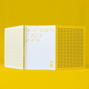
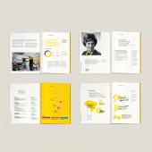
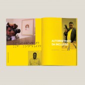
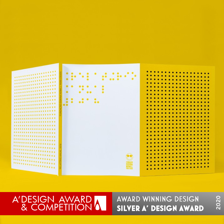
The Dorina Nowill Foundation serves people who are blind or have low vision. Braille writing is incorporated into the daily life of this community. For the design of its annual report, Laika started from this premise and used the points of writing, both in tactile and visual aspects, to compose the graphic identity of this publication. In this way, the points form phrases throughout the publication, in parallel with the graphical writing, composing textures that refer to the foundation's brand.
UNIQUE PROPERTIES / PROJECT DESCRIPTION:
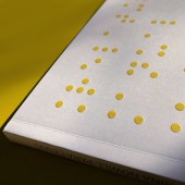
The annual report is permeated by elements in Braille, which dictate the pace of publication and function as components of interaction with the lay reader, bringing him to experience or know this model of writing. Altogether, the pages permeated by the writing of the blind integrate form - writing - and content - subject -, providing an inclusive meaning to the book. Another relevant detail: the cover has a relief print on the dots, allowing blind people to experience tactile reading.
OPERATION / FLOW / INTERACTION:
The annual report is intended to mark the entity's fiscal year and establish guidelines for the following year. In addition to the functional aspect of the publication, its aesthetic and graphic aspect is essential to set the date, give the document a longevity and validate its relevance to the sector. As a supporting document and material, it has another fundamental function: to serve as a presentation of the foundation and to contribute to attract sponsors from medium and large companies.
PROJECT DURATION AND LOCATION:
The project started in February 2019 and finished in May 2019 in Sao Paulo, Brazil.
|
PRODUCTION / REALIZATION TECHNOLOGY:
The cover has a proportional book ear, at full opening, a panoramic view of the use of Braille writing points. Still on the cover, the use of dry relief provides a tactile experience to the reader, offering points of braille writing. The publication was printed in CMYK-scale colors, on offset paper, mainly because it offers the tactile aspect due to its porosity.
SPECIFICATIONS / TECHNICAL PROPERTIES:
Cover: sheet format 640 x 280 mm; Core: Print format 210 x 280 mm. Cover printed on offset paper 240 g/m2, 4X4 colors (CMYK). Core composed of 120 pages in 150 g/m2 offset paper, 4x4 colors. Finish: dry relief on the cover.
TAGS:
Annual report, print, editorial, graphic design, branding identity
RESEARCH ABSTRACT:
The Laika method is based on the synergy between linguistic and pictorial skills. Every project begins with the construction of meaning, an affirmation, and the need to design small graphic narratives. Thus, the Dorina Nowill annual report expands upon the detailed and strategic work of building an imaginary universe that represents the culture of the Dorina Nowill brand.
CHALLENGE:
The challenge was to develop a publication that, in addition to fulfilling its functional aspects of informing and maintaining the commitment to the governance policy of the Dorina Nowill Foundation, also represented a document that addressed the aspect of the need to include blind or with low vision people.
ADDED DATE:
2020-02-10 18:10:20
TEAM MEMBERS (1) :
Ruis Vargas, Creative Directo, Thiago Siqueira and Agnes Svilenov, Designer
IMAGE CREDITS:
Laika Design
PATENTS/COPYRIGHTS:
Arthur Medeiros
|
| Visit the following page to learn more: http://www.laika.com.br |
|
| CLIENT/STUDIO/BRAND DETAILS |
 |
NAME:
Laika
PROFILE:
Laika is a design studio in a small tree-lined village in São Paulo. Just like the space travel female dog that gave its name to the Laika office, it's a way of looking at the same object from a different point of view. Since 2001, Laika has been traveling through the most diverse design modalities, always beginning from a method that starts from semiology and discourse analysis, for brand building.
|
|
|
| COMMENTS |
| Giulia Esposito |
Comment #10980 on December 27, 2022, 12:37 am |
|
I'm absolutely in awe of this Annual Report design by Ruis Vargas. Everything about it is so eye-catching and well thought out. From the vivid colors to the clever use of negative space, every element makes the report look professional and organized. I love how it manages to be creative and unique while still staying true to its purpose of presenting the information in a clear, concise way. It's obvious that a lot of thought and effort went into this design, and it definitely paid off. Great job on this amazing work! Congratulations Ruis Vargas!
|
| Paul Williams |
Comment #53671 on January 3, 2023, 7:02 pm |
|
I am truly inspired by the design of Dorina Nowill. Ruis Vargas has combined the power of Braille writing with a visually stunning design that creates an inclusive and engaging experience. The cover is particularly noteworthy, with its relief print on the dots allowing blind people to experience tactile reading. The design is truly innovative, with the points of writing creating a narrative that perfectly captures the spirit of the Dorina Nowill Foundation. This award-winning work is an excellent example of how design can be used to create a more inclusive world.
|
| Paul Phillips |
Comment #62174 on January 3, 2023, 11:08 pm |
|
I'm truly in awe of this work! The concept of integrating Braille elements into a print publication is incredibly clever and inspiring. It is so amazing to see how the designer was able to create a truly inclusive experience by combining form and content in this way. The cover with its relief print is a particularly nice touch, allowing blind people to experience tactile reading and appreciate the design just as much as anyone else. This is a truly innovative piece of design and a deserving winner of the A' Design Award.
|
| Elena Petrenko |
Comment #66004 on January 4, 2023, 12:47 am |
|
This award-winning work successfully captures the experience of blind or low-vision readers, showcasing the innovative use of Braille writing points to create a truly inclusive publication.
|
| Adam Harris |
Comment #70865 on January 4, 2023, 3:06 am |
|
I am awed by the beautiful design of the Dorina Nowill annual report! The incorporation of Braille into both the tactile and visual aspects of the report creates a unique and meaningful experience for both the reader and the blind. The use of the points of writing to compose the graphic identity of the publication is truly inspiring and demonstrates Ruis Vargas' mastery of design. The detailed and strategic work in constructing an imaginary universe to represent the culture of the Dorina Nowill brand is truly remarkable. Overall, this award-winning design is a testament to the power of good design and its ability to create meaningful experiences.
|
| Chloe Turner |
Comment #80275 on January 4, 2023, 7:57 am |
|
What an incredible piece of design! It's so inspiring to see a project that celebrates the everyday experience of the visually impaired community, and this annual report does just that. The use of tactile and visual Braille writing is so creative and clever, seamlessly intertwining both aspects to create a cohesive identity. It's one of those projects that feels truly meaningful, and I'm sure it resonates with the community it was created for. Kudos to the designer, Ruis Vargas, for creating something so unique and powerful!
|
| Mark Allen |
Comment #82213 on January 4, 2023, 9:15 am |
|
This award-winning work is a fantastic example of how design can be used to create an inclusive, meaningful experience. The incorporation of Braille writing within the publication and the use of a dry relief on the cover to provide a tactile experience are both incredibly innovative and serve to create a truly unique document. The research and production methods used to create this piece of work are also particularly impressive, creating a publication that both informs and celebrates the culture of the Dorina Nowill Foundation.
|
| Elisabeth Clark |
Comment #83506 on January 4, 2023, 10:17 am |
|
I'm so impressed with the work of Ruis Vargas for their award-winning design of the Dorina Nowill annual report. It is clear that a lot of thought and research went into creating this beautiful piece of design. I love how the elements of Braille are incorporated into the design, creating an inclusive and tactile reading experience. The cover is also incredibly clever, with the relief print on the dots allowing blind people to experience tactile reading. The attention to detail and dedication to creating a work that is both meaningful and visually appealing is truly remarkable. This is a wonderful example of good design, and well deserving of the A' Design Award. Congratulations Ruis Vargas!
|
|
|
Did you like Ruis Vargas' Print Design?
You will most likely enjoy other award winning print design as well.
Click here to view more Award Winning Print Design.
Did you like Dorina Nowill Annual Report? Help us create a global awareness for good print design worldwide. Show your support for Ruis Vargas, the creator of great print design by gifting them a nomination ticket so that we could promote more of their great print design works.
|
|

|
|
|
|
