The Birth of a Book Scientific Publication by Urszula Giren |
Home > Winners > #97144 |
 |
|
||||
| DESIGN DETAILS | |||||
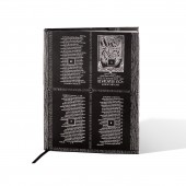
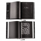
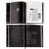
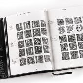
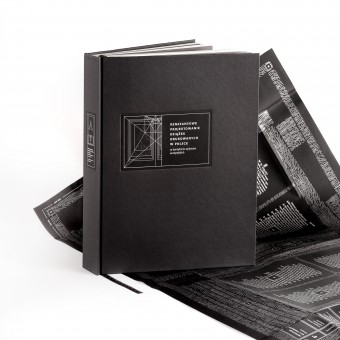
| DESIGN NAME: The Birth of a Book PRIMARY FUNCTION: Scientific Publication INSPIRATION: The main inspirations were the general principles of Renaissance design. The first stage of the project included gathering graphic material necessary to conduct research on the old European, Polish books. The study covered individual elements, starting from the materials from which books were created: papers, binding materials, typefaces, ornaments, graphics. Information was also collected on the most well-known Polish and European publishers, typographers and punchcutters. UNIQUE PROPERTIES / PROJECT DESCRIPTION: The designed structure of publications presents the old prints in real size and the method of their production in additional elements like a dust jacket which show printing sheet, typographic composition at 1:1 scale. The woodcuts in color inversion on the title pages refer to matrices covered with black ink. The compositions of this pages were plotted on a scheme invented by Villard de Honnecourt, 13th century artist, and refer to the proportions of columns, margins used in the 16th century. OPERATION / FLOW / INTERACTION: All the elements in the book have been designed to familiarize the reader with the methodology of creating books in the 16th century. Starting from the format of the book showing real formats of old prints, to the dust jacket presenting the printing imposition, or the ribbon indicating the height of old books - folio, quarto, otavo. PROJECT DURATION AND LOCATION: The project started in May 2017 in Bialystok and finished in February 2019 in Katowice, Poland |
PRODUCTION / REALIZATION TECHNOLOGY: The work was digitally printed and a hardback, paper binding, thermo-gluing was used. The covering is made of black beater-dyed paper. There are also a dust jacket reflecting an imposition method for the old octavo book format, as well as a ribbon - bookmark, depicting the folio, quarto and octavo heights. Covering: Geltex Negro Antracita 191 Embossing LS 115 g (beater-dyed paper), silver color - screen printing, binder's board: spine board 2 mm, base case 3 mm, Dust Jacket: Color Style Black Smooth 120 g (beater-dyed paper) silver color - screen printing, Endpaper: Geltex Negro Antracita 191 Embossing LS 130 g (beater-dyed paper), Book-block: Pergraphica Natural Smooth 120 g, CMYK - digital printing, HP Indigo, printing according to fiber direction, PUR glue, Headband: Black, Ribbon bookmark: Black, silver color SPECIFICATIONS / TECHNICAL PROPERTIES: Format: 256 x 320 mm in a 1.25 ratio, 560 pages, the page format allowed the calculation of a multi-level grid for the composition of individual elements, including 1200 illustrations. TAGS: renaissance book, first roman typefaces, old prints, typography RESEARCH ABSTRACT: The first part of book contains basic information about printing, introduces the reader to the general principles of Renaissance design. In the second part of the publication, printing in Poland was discussed in more detail. This part was divided into 5 chapters, four of which have been assigned specific cities. The choice of places was justified by the pioneering activity of the printing houses, which opened there, their size, as well as the quality of the publications they produced. CHALLENGE: The biggest challenge was complicated structure of the text - a lot of auxiliary and descriptive texts, an unusually large number of various illustrations - 1274. Organizing the appropriate grid required several verifications. I based the project largely on mathematical calculations related to the content of the publication. The divisions and colors used resulted entirely from the content and the assumption of the best possible exposure of illustrations and text. By learning the methodology of 16th-century typographers, you can see frequent references to numbers that have always been present in nature. The search for systematization the surrounding world by the renaissance artists was huge inspiration. Each element in the world has its place and meaning, nothing is accidental, everything is connected with each other and interacts with each other. I also wanted to build a relationship system in the design of my publication, where the smallest part would result from the structure of the whole. ADDED DATE: 2020-01-20 14:31:37 TEAM MEMBERS (1) : IMAGE CREDITS: Urszula Gireń / 2019 |
||||
| Visit the following page to learn more: https://cutt.ly/GrOjpiZ | |||||
| AWARD DETAILS | |
 |
The Birth of a Book Scientific Publication by Urszula Giren is Winner in Print and Published Media Design Category, 2019 - 2020.· Read the interview with designer Urszula Giren for design The Birth of a Book here.· Press Members: Login or Register to request an exclusive interview with Urszula Giren. · Click here to register inorder to view the profile and other works by Urszula Giren. |
| SOCIAL |
| + Add to Likes / Favorites | Send to My Email | Comment | Testimonials | View Press-Release | Press Kit |
Did you like Urszula Giren's Print Design?
You will most likely enjoy other award winning print design as well.
Click here to view more Award Winning Print Design.


