DESIGN NAME:
Aesthetic Concerto
PRIMARY FUNCTION:
Residential
INSPIRATION:
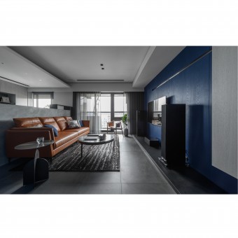
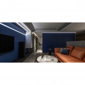
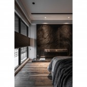
The client requested for a distinct and personal taste of the space style, and expecting the large dark blue area in the main living space, and reveal the personality of the space. Therefore, the design team uses simple lines to outline the whole room, variety shades of gray as the base colors, and then integrate different geometric shapes and appropriately give asymmetric combinations, decorate each area, bringing visual interest to the area.
UNIQUE PROPERTIES / PROJECT DESCRIPTION:
Different from the houses with white as the vocal point and emphasize of the sense of symmetrical order, this project uses the strong blue color to create a visual focus, and use color and modeling elements to show asymmetrical changes in the details, make a static space pictures to transmit dynamic image, and follow the principle of change in unity to create a contrast indoor environment.
OPERATION / FLOW / INTERACTION:
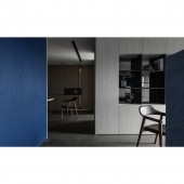
The original 3 plus 1 layout configuration not only cuts the space into extreme fragmentation, but also does not meet the living patterns and needs of the current occupants. To maintain a suitable spatial scale in the private and public areas and maintain the quality of living space, the layout has been converted into two bedrooms and the master bedroom has a walk in closet. In response to answer the storage need, the design team also integrated the cabinets with the wall surface and door panels to maintain an coherent and neat space facade.
PROJECT DURATION AND LOCATION:
The project was completed in November, 2019 in New Taipei City, Taiwan.
FITS BEST INTO CATEGORY:
Interior Space and Exhibition Design
|
PRODUCTION / REALIZATION TECHNOLOGY:
Wood veneer, quartz brick, special paint imitation concrete, stainless steel, walnut parquet, oak wood parquet, marble.
SPECIFICATIONS / TECHNICAL PROPERTIES:
The total design area is about 116 square meters, and the layout areas including the entrance, living room, dining room, kitchen, two bedrooms and two bathrooms.
TAGS:
Modern minimalist, navy blue, gray color gradation, concrete-like paint, geometric changes, residential design.
RESEARCH ABSTRACT:
Although the whole project is shaped by bold and strong elements that the owner wanted, but we also consider the balance that should be experienced in a long-term residence by carefully studied the proportion of each shape and color, and sought balance and asymmetric change in the harmonious beauty. The different levels of gray scale gradations are used in the public space to achieve a calm atmosphere, while at the same time also accentuating the richness of dark blue tone. The dark blue main wall and the long strip of wall line play a role in guiding vision and circulation lines; the door is designed hidden on the facade.
CHALLENGE:
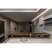
The first challenge in the design is the color expression from the public area. In order to turn the special preference of the homeowner into the protagonist in the space, the overall color scheme including the walls and the furniture must be able to achieve a clear and coordinated effect. The second problem is the serious shortage of lighting in the kitchen area. In addition, the client does not want to have extra decorative lamps. Finally, the design team matched the linear light strips on the ceiling to increase the lighting, and at the same time created a special feature that is conducive to warm family atmosphere.
ADDED DATE:
2020-01-13 05:46:18
TEAM MEMBERS (2) :
Hsiao-Chi Chiang and Cih-Yu Wong
IMAGE CREDITS:
Andy Chang
|
