Find Way Office by Lycent Lai |
Home > Winners > #96517 |
 |
|
||||
| DESIGN DETAILS | |||||
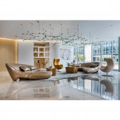
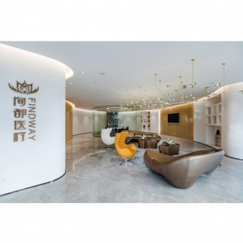
| DESIGN NAME: Find Way PRIMARY FUNCTION: Office INSPIRATION: In order to meet the needs of the company's overall operation, and at the same time to seek the satisfaction of multiple functions in the limited space, the designer has built the entire space into a layout mode of front store and back factory. He respects the original architectural structure features of the building. On the basis of retaining the original straight line of the wall, reversely makes some curves to fully meet the use function, while highlighting the unique and Personality. UNIQUE PROPERTIES / PROJECT DESCRIPTION: In the project of Xundu Health and Beauty Shanghai Headquarters, the designer balanced the modern business trend with exquisite artistic style and recalled the lost aesthetic feelings in the indifferent and alienated city. There is no conventional space structure, rigid and soft material matching, which makes people seek a surreal balance in the world. Let customers in the pursuit of external promotion at the same time, get inner peace and abundance. OPERATION / FLOW / INTERACTION: The numerous molecular chandeliers are arranged in the ceiling. The brass bracket and Turquoise blown glass ball diffuse the warm yellow halo. The shape is very creative and aesthetic, and the details are exquisite and exquisite. It lets people feel the extending, also makes the whole space clear-cut and warm. PROJECT DURATION AND LOCATION: The project started in May 2018 in Shanghai and finished in August 2018 in Shanghai. FITS BEST INTO CATEGORY: Interior Space and Exhibition Design |
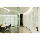
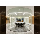
PRODUCTION / REALIZATION TECHNOLOGY: From the entrance, the simple white and log color matching inside, the collision with the gray tiles on the ground, giving people a low-key luxury. Through natural stone and wood texture, the designer shows the change of the depth of the space and outlines the concise lines to create a balanced, harmonious and continuous flowing space environment. SPECIFICATIONS / TECHNICAL PROPERTIES: The project covers a total of 412 square meters. As a space to maximize the expression of this case, the hall integrates multiple functions such as reception, conference, publicity, etc. TAGS: Interior, Office, Commercial, Natural, Elegant, Cultural, Simple, Health and Beauty, Headquarters RESEARCH ABSTRACT: Under the premise of consumption upgrading, space experience is more and more like a kind of rigid demand. In order to emphasize the natural, healthy and modern atmosphere, the designer tries his best to get rid of the sharp edges and relatively strong modeling, set up the space relationship between the boxes in the high and low lattice, and provide the office space that can be flexibly combined and adjusted according to the use needs. CHALLENGE: One of the key points of the project design is to transform the abstract artistic expression into perceptible spatial language and increase the benefits for business operation. The reception center is adopted convergent layout, making the field more concise. It is not only a simple artistic expression, but also a resolution of the limitations of the original space. ADDED DATE: 2020-01-07 12:03:13 TEAM MEMBERS (1) : Lycent Lai IMAGE CREDITS: Image #1: Photographer Fei Lin, Hall, 2018. Image #2: Photographer Fei Lin, Negotiation Area, 2018. Image #3: Photographer Fei Lin, Negotiation Area 2, 2018. Image #4: Photographer Fei Lin, Conference Room, 2018. Image #5: Photographer Fei Lin, Conference Room 2, 2018. PATENTS/COPYRIGHTS: Copyrights belong to Lycent Lai, 2018. |
||||
| Visit the following page to learn more: http://c7.gg/fTtGY | |||||
| AWARD DETAILS | |
 |
Find Way Office by Lycent Lai is Winner in Interior Space and Exhibition Design Category, 2019 - 2020.· Press Members: Login or Register to request an exclusive interview with Lycent Lai. · Click here to register inorder to view the profile and other works by Lycent Lai. |
| SOCIAL |
| + Add to Likes / Favorites | Send to My Email | Comment | Testimonials | View Press-Release | Press Kit |


