Heytea Xi'an Store by Uno Chan |
Home > Winners > #96002 |
 |
|
||||
| DESIGN DETAILS | |||||
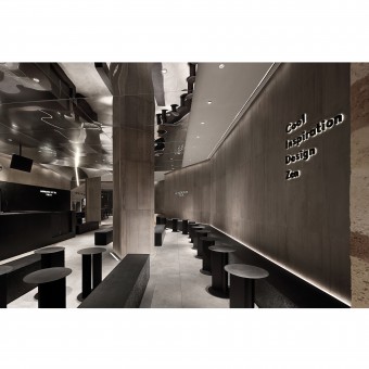
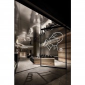
| DESIGN NAME: Heytea Xi'an PRIMARY FUNCTION: Store INSPIRATION: How to continue the business logic of the brand reasonably, meet the iterative needs of function and style, and stand out from the numerous stores in the mall, this is the direction of disign thinking. The presentation of the facade integrates the characteristics of the original architectural structure and commercial form of the site, and turns the interesting thinking into the combination scene of indoor and outdoor furniture. UNIQUE PROPERTIES / PROJECT DESCRIPTION: This case is a design project of a new tea brand chain store. The designer creates a pure and concise space by using rammed earth in modern architecture and combining cement, mirror and metal materials in the form of geometric blocks, in response to Heytea always adhere to the simple and exquisite brand concept. OPERATION / FLOW / INTERACTION: The interior landscape design makes full use of the scattered space, through the division of material, light color and lustre, it not only embodies the visual artistry, but also blends into the modern sense of neatness. PROJECT DURATION AND LOCATION: The project started in March 2019 in Xi'an and finished in May 2019 in Xi'an. FITS BEST INTO CATEGORY: Interior Space and Exhibition Design |
PRODUCTION / REALIZATION TECHNOLOGY: Rammed earth material reflects the texture of time precipitation, contrasts with the atomized glass on the facade, and engraves the rhythm of space and the beauty of texture. On the other side of the street, wheat ears and reeds are used to create a large area of landscape, enhance the experience atmosphere of the external exhibition area, and strengthen the interaction inside and outside the store. SPECIFICATIONS / TECHNICAL PROPERTIES: The project covers a total of 320 square meters. Open the door and come in, an unobtrusive gray space shows the ultimate charm of elegance and cool. From overall planning to detail control, the interior design follows the consistent restraint and balance of the brand, and completes the expression of smooth and clean space with transparent, pure and delicate visual presentation. TAGS: Interior, Commercial, New Tea, Chain Store, Natural, Elegant, Cool, Pure RESEARCH ABSTRACT: As the entrance to the outside of the shopping mall is close to the stairs, a part of the interior space is compressed to the lower part of the building stairs, which needs to be weakened by design. The interior area uses the reflection of matte stainless steel to enhance the modern tonality of the entire space. The space is subtly solved by the building cylinder, and the column is expressed by the special body block device, which makes the narrow space more rhythmic and interesting. CHALLENGE: With the help of the reflection of stainless steel on the fog surface, the designer creates a ceiling area full of installation sense and drama, which improves the modernity of the whole space. The light hidden in the gap of the body block sprinkles mottled light and shadow, which brings the attraction and appeal, makes the whole space full of advanced and mysterious charm. ADDED DATE: 2019-12-24 08:26:03 TEAM MEMBERS (1) : Uno Chan IMAGE CREDITS: Image #1: Photographer ingallery, Corridor, 2019. Image #2: Photographer ingallery, Entrance, 2019. Image #3: Photographer ingallery, Lobby, 2019. Image #4: Photographer ingallery, Bar, 2019. Image #5: Photographer ingallery, Bar 2, 2019. PATENTS/COPYRIGHTS: Copyrights belong to Uno Chan, 2019. |
||||
| Visit the following page to learn more: http://www.tomodesign.cn | |||||
| AWARD DETAILS | |
 |
Heytea Xi'an Store by Uno Chan is Winner in Interior Space and Exhibition Design Category, 2019 - 2020.· Press Members: Login or Register to request an exclusive interview with Uno Chan. · Click here to register inorder to view the profile and other works by Uno Chan. |
| SOCIAL |
| + Add to Likes / Favorites | Send to My Email | Comment | Testimonials | View Press-Release | Press Kit |


