|
|
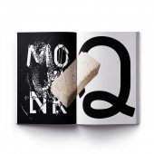
Monk Latin and Arabic Geometric Typeface Design by Paul Robb |
|
|


|
|
| DESIGN DETAILS |
DESIGN NAME:
Monk Latin and Arabic Geometric
PRIMARY FUNCTION:
Typeface Design
INSPIRATION:
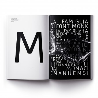
The font family has its origins from the Benedictine and Franciscan writing. Originally designed as a Latin typeface it was quickly seen that we needed to open a wider dialogue and expand the font to include an Arabic version, using the same rationale to the design. The strength of the parallel design process allows the two typeset languages to have balanced harmony and grace.
UNIQUE PROPERTIES / PROJECT DESCRIPTION:
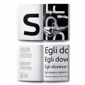
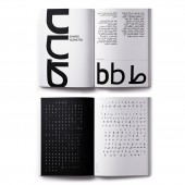
Monk is a multi-language geometric harmoniously balanced font in Arabic and Latin. The font family has its origins from the Benedictine and Franciscan writing. Both Arabic and Latin work seamlessly together having shared counters, stem thickness, and curved forms. Monk is a type family that seeks a balance between the openness and legibility of humanist sans serifs. Letterforms have a distinct direction of the ductus, a wide overall stance, large open counters that help in its legibility.
OPERATION / FLOW / INTERACTION:
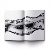
Our underlying concept was to develop a font that could communicate harmoniously in Arabic and Latin that was constructed with shared geometry. When used in an Arabic text western words would be seamlessly intergraded in the text.
PROJECT DURATION AND LOCATION:
The Project started in 2017 and finish in September 2018, in Perugia Italy.
|
PRODUCTION / REALIZATION TECHNOLOGY:
Designed and produced in Fontographer
SPECIFICATIONS / TECHNICAL PROPERTIES:
True Type and Open Source Font
TAGS:
Typeface design, Font Design, Font Family, Monk, Graphic typeface
RESEARCH ABSTRACT:
The Monk font family has its origins from the Benedictine and Franciscan writing. The initial research was based around the ancient text stored in and around Umbria in central Italy. Analyzing the form and structure of the monk's letter we created a modern approach to the forms creating repeatable geometric curves, which were applied first to create the Latin font. With a concept of open discussion through the religions, the next logical step for us was to develop those design rationals to Arabic lettering with the development of two harmonious fonts.
CHALLENGE:
The challenge was to create a modern typeface based on the historical research.
ADDED DATE:
2019-12-23 16:49:43
TEAM MEMBERS (5) :
Design direction: Paul Henry Robb, Latin Font: Paul Henry Robb, Arabic Font: Naser Imache - Paul Robb, Design Ass: Tommaso Calderini and
IMAGE CREDITS:
© Paul Henry Robb, Salt & Pepper
PATENTS/COPYRIGHTS:
© Paul Henry Robb, Salt & Pepper 2018
|
|
| CLIENT/STUDIO/BRAND DETAILS |
 |
NAME:
Salt & Pepper
PROFILE:
Based in Perugia central Italy, we infuse design and technology with a human element, creating experiences that capture and expand upon our clients’ visions. Over the past 20 years, we have created and developed, integrated solutions, campaigns, and products for a diverse portfolio of brands, both in the private and public sectors, in Italy and internationally. We have developed brands, websites, mobile and tablet apps, events, documentaries, viral films, digital installations, games, retail experiences, social media channels and even found time to produce some advertising. Our work has been nominated 3 times for the prestigious Italian ADI Design Index - Compasso d’oro 2014,2016,2020, once for UI & UX and the second and third for branding and communications. In 2019 we were awarded Gold by A’ Design Award in Advertising, Marketing, and Communication Design Category by the International Design Academy. Nominated for the Designer of the Year by the IAD (International Association of Designers). Our work has featured in both design compendiums and publications and exhibited both nationally and internationally.
|
|
|
| COMMENTS |
| Giulia Esposito |
Comment #10751 on December 26, 2022, 11:21 pm |
|
I am absolutely delighted to have seen the creative and breathtaking work of "Monk Latin and Arabic Geometric". This typeface design was an inspiring and innovative combination of two distinct cultures, combining them into one unique and powerful design. This is a remarkable achievement and I'm impressed by the effortless melding of these two distinct cultures, creating a harmonious work. The intricate details in the design are truly remarkable and demonstrate the high level of skill and creativity of the designer. It is an honor to see this typeface design rewarded with the A'Design Award and I congratulate Paul Robb for this amazing accomplishment.
|
| Paul Williams |
Comment #53012 on January 3, 2023, 6:43 pm |
|
I am absolutely captivated by Monk Latin and Arabic Geometric. Paul Robb has created a harmonious font family that is incredibly balanced and open, allowing for legibility and clarity in both Latin and Arabic. The stem thickness, counters, and curved forms are all in perfect harmony, creating a typeface that is equal parts beautiful and functional. The design process was driven by the research and analysis of ancient text, and the use of geometric curves to create a modern approach. It's no wonder Monk Latin and Arabic Geometric has won an A' Design Award!
|
| Paul Phillips |
Comment #61449 on January 3, 2023, 10:47 pm |
|
As a design enthusiast, I'm absolutely inspired by the Monk Latin and Arabic Geometric typeface design. The harmonious balance between the two languages is remarkable and its origins from the Benedictine and Franciscan writing are quite evident. The legibility of the font is quite remarkable, with its open counters, stem thickness and curved forms creating a perfect balance between the openness and legibility of humanist sans serifs. Its direction of the ductus, wide overall stance, and large open counters make it quite a unique and well-crafted font. I am in awe of the designer's success in creating such a beautiful typeface and I congratulate them for being awarded the A' Design Award.
|
| Elena Petrenko |
Comment #65219 on January 4, 2023, 12:26 am |
|
This award-winning work is an elegant and harmonious fusion of two vastly different languages, creating a modern typeface that pays homage to its historical roots.
|
| Adam Harris |
Comment #69728 on January 4, 2023, 2:34 am |
|
I am in awe of this award-winning typeface design! Monk Latin and Arabic Geometric is an incredibly impressive example of combining two languages in harmony and grace. Every detail has been carefully thought out, from the shared counters and stem thickness to the wide overall stance and large open counters. It is clear that a lot of research and dedication went into the design of this font, making it a truly remarkable work. Congratulations to the designer for their amazing achievement!
|
| Chloe Turner |
Comment #79307 on January 4, 2023, 7:21 am |
|
I am filled with admiration for this award-winning typeface design! Combining the Latin and Arabic languages in one beautiful font is a tremendous achievement. The harmony and grace that radiates from the font is a testament to the parallel design process. I am deeply impressed by the designer's skill and creativity in creating a typeface that communicates so effectively between two languages. Truly remarkable work!
|
| Mark Allen |
Comment #81194 on January 4, 2023, 8:34 am |
|
This award-winning typeface design is truly remarkable. It is a bold and innovative take on combining the Latin and Arabic languages into one harmonious font. It is clear that a great deal of research and thought has gone into creating a font that is both legible and open, while still maintaining a distinct direction of the ductus. This font is sure to be appreciated by both design professionals and amateurs alike.
|
| Elisabeth Clark |
Comment #82650 on January 4, 2023, 9:34 am |
|
I'm absolutely in awe of Paul Robb's "Monk Latin and Arabic Geometric" typeface design. It's truly a work of art! The harmonious balance between the two languages, Latin and Arabic, is so captivating. The design's origin from Benedictine and Franciscan writing is also very impressive. It's clear that the design has been created with a great deal of research and thought. The open counters, stem thickness and curved forms help to create an incredibly legible and beautiful typeface. Paul Robb deserves recognition for this amazing accomplishment!
|
|
|
Did you like Paul Robb's Graphic Design?
You will most likely enjoy other award winning graphic design as well.
Click here to view more Award Winning Graphic Design.
Did you like Monk Latin and Arabic Geometric Typeface Design? Help us create a global awareness for good graphic design worldwide. Show your support for Paul Robb, the creator of great graphic design by gifting them a nomination ticket so that we could promote more of their great graphic design works.
|
|

|
|
|
|


